
Hello there everyone! We’re on our way to completing yet another unit, and I’m ecstatic to say I’ve learned a lot! Today I’m back with the first part of my reflection on the overall experience!

And so, we begin with our project guide. Here we received a quick review on what we shall be doing during this particular unit.
This included an introduction to the driving question we will be discovering during the span of this exciting new journey; “How does what we Hear, Read, and See Influence Us?”
So, we take a quick step back and reflect on the main thing we will need to pursue and truly understand in order to begin; “Why Am I Learning This?”
During this project, we will be fully diving into our understanding of media and messages. We will be learning about how these small little influences drive our choices and decisions.
While fully discovering these understandings and influences, we will learn how to become a “better educated citizen”. We could even uncover things about ourselves that were unknowingly driven from these aspects, and become aware of how media affects us.
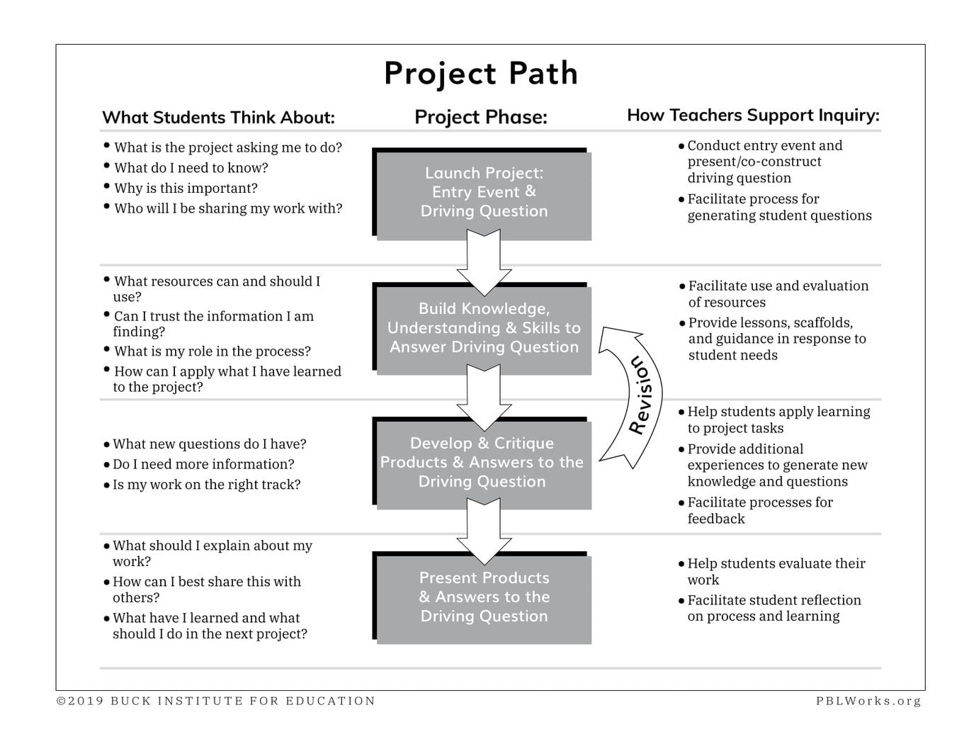

Now that we’ve discovered the topic of this project and it’s importance, it’s time to move onto Launch. In Launch, we kick off this new project with some brainstorming, recovering the things we already know, and overall, just scraping the surface of the this topic.

First off, I feel that the most important thing I should mention was that we were each given 4 individual groups that specified in different things.
The first group we were introduced to were our North Groups. This group will be our project group, and we’ll be working with this team to create our advertisements later on.
The next group is our East Groups. While in this group, we learned about graphic design and photography… and also received critique on our individual advertisement drafts.
Another group is our South Groups. This is our analysis group where we learned to analyze different forms of media (such as Welcome Home), and where we completed our “Larry Discussions.”
The final group I will mention is our West Groups. Here we learned about the basics of advertising as a whole, and the different techniques and appeals media can use to persuade us to purchase a specific product.

This unit, we’ve done most of our learning in a team setting. One of the first things we’ve done during launch is discovering what it really means to work together as a group.
Here, we discovered that one of the most important parts about PLP is working as a team; our entire class of PLP 8 is a team. Throughout our time in this project and future endeavours to come, we will be expanding on these skills and relying on them constantly.
One of the highlights from this discussion was when we watched the following video that showed the fruits of good teamwork and displayed the importance of doing your part (however small that part may be.)
Next off in Launch, we began to reflect on our summer learning. This summer, we were assigned to complete assignments surrounding reading, drawing, and journaling to get a good understanding of our iPads and play around with some of the apps we’ve been given.
We were separated into our North Groups, and given a Wipebook to jot down or brainstorm, as a team, what we’ve learned from the summer assignments. Then we shared these as a class, and had a short discussion on our ideas.
Then we continued on to the next important step in Launch; developing our “need to knows.”
Our “NTKs” are questions that we need to know the answers to in order to complete this project to the best of our understandings. We often do this by brainstorming the questions we have in a group setting.
In our North Groups again, we began to write down the questions and things we needed to know on the sticky notes provided by the teachers. We then plastered these notes onto the opposite side of our Wipebook in categories depending whether the question had to do with the Product (the creation we make to share our learning), the Process (the steps/strategies we take to learn and gain knowledge), or the Content (the idea we’re learning.)
During the duration of this project, we often revisited these NTKs and added new questions, or took away the ones we already learned/knew.
The final part of Launch was to watch an advertisement called “Welcome Home” which was proclaiming Apple’s product; the HomePod.
At first, we began by actually watching the video itself, but meanwhile, quickly and roughly sketching using Notes to show how it emotionally impacts you.
Here’s mine:


Now, we finally arrive to our first Milestone. Here we reflected and fully analyzed the text in the “Welcome Home” advertisement.
On another note, we also discovered that “text” doesn’t specifically mean writing, but it actually applies to practically anything that communicates.
Before, in our South groups, we had attempted to decide what this advertisement is trying to persuade the audience to buy, and what is their target audience.
Our task in this milestone was to individually write a paragraph that explain your analysis of Welcome Home’s message and how they get it across to their target audience.
Check out mine here: milestone-1-welcome-home-text-analysis.pages

After completing Launch, we moved on to Building Knowledge. We specifically learned a lot of things in the Building Knowledge phase of this project that would help us later on in the project path.
One of the many things we learned during Building Knowledge was the overall basics of photography. I’m going to reflect specifically on that portion first.
We started our photography journey with some tips on how to take a good still image.
We began with the composition of still images, and the importance of some aspects in an image. One of such aspects is backgrounds.

Backgrounds have a supplementary effect on photos as a tool to highlight the main focus on an image. A background that does not support the rest of a photo can be distracting and deteriorate the impact of the image. It is very important to use a good background so that it can draw attention to the main focus, instead of elsewhere.
There are many helpful tools that can assist in achieving a good background in a photo. These tools can include the following:
- Leading Lines is where you can use the “lines” in the background of an image to guide the viewer’s eyes to the main subject/focus
- The Foreground can be used when there are two “layers” in a photo, and it can put emphasis on the “layer” in the Foreground of an image
- Framing can help move the focus on the main subject of the photo by using other things in the background to put a frame around the main focus, such as a tunnel or an arch
After learning about backgrounds, we were separated into our East groups to take photos using these tools/tips. Personally, I’m definitely going to continue to utilize these tips in the future.
Here is the photo my group took while attempting to use the Foreground method:

Next, we moved on to the Rule of Thirds, which can be a very important aspect of photography.
Instead of always capturing the main focus of an image in the centre of the frame, you also have the option to use the Rule of Thirds. This allows the photographer to place the subject in the other parts of the background, while still maintaining the important focus of the viewer.
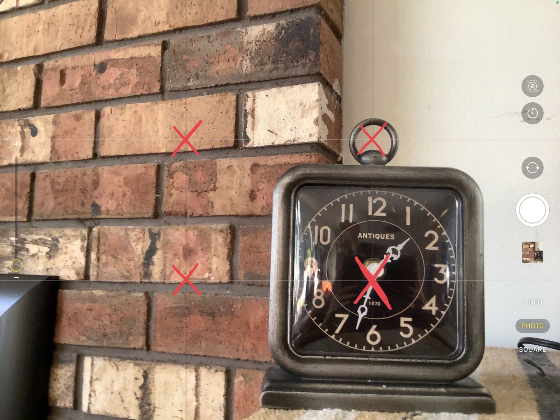
We learned how to activate the grid setting in photos so that we can use the Rule of Thirds in our images. As you can see in the image above, there are red Xs slashing over where the lines on the grid connect. Placing the subject of your photo in those areas is another way to bring attention to the main focus of your visual.
Then we had a brief introduction to camera angles, which also allowed us to have a good opportunity to try to incorporate the Rule of Thirds in some photography.
The following are the some examples of camera angles:
- Bird’s Eye View is where you take a photo of your subject from a high vantage point to give an illusion to make it look like it’s from a Bird’s View
- Worm’s Eye Perspective is where you take a photo of your focus from below, it can look although it’s from a worm’s or insect’s view. This is the opposite of Bird’s Eye View
- Close Up is taking a photo of your subject from a close point
- Long Shot is taking a photo of your subject from a far off point. This is the opposite of Close Up.
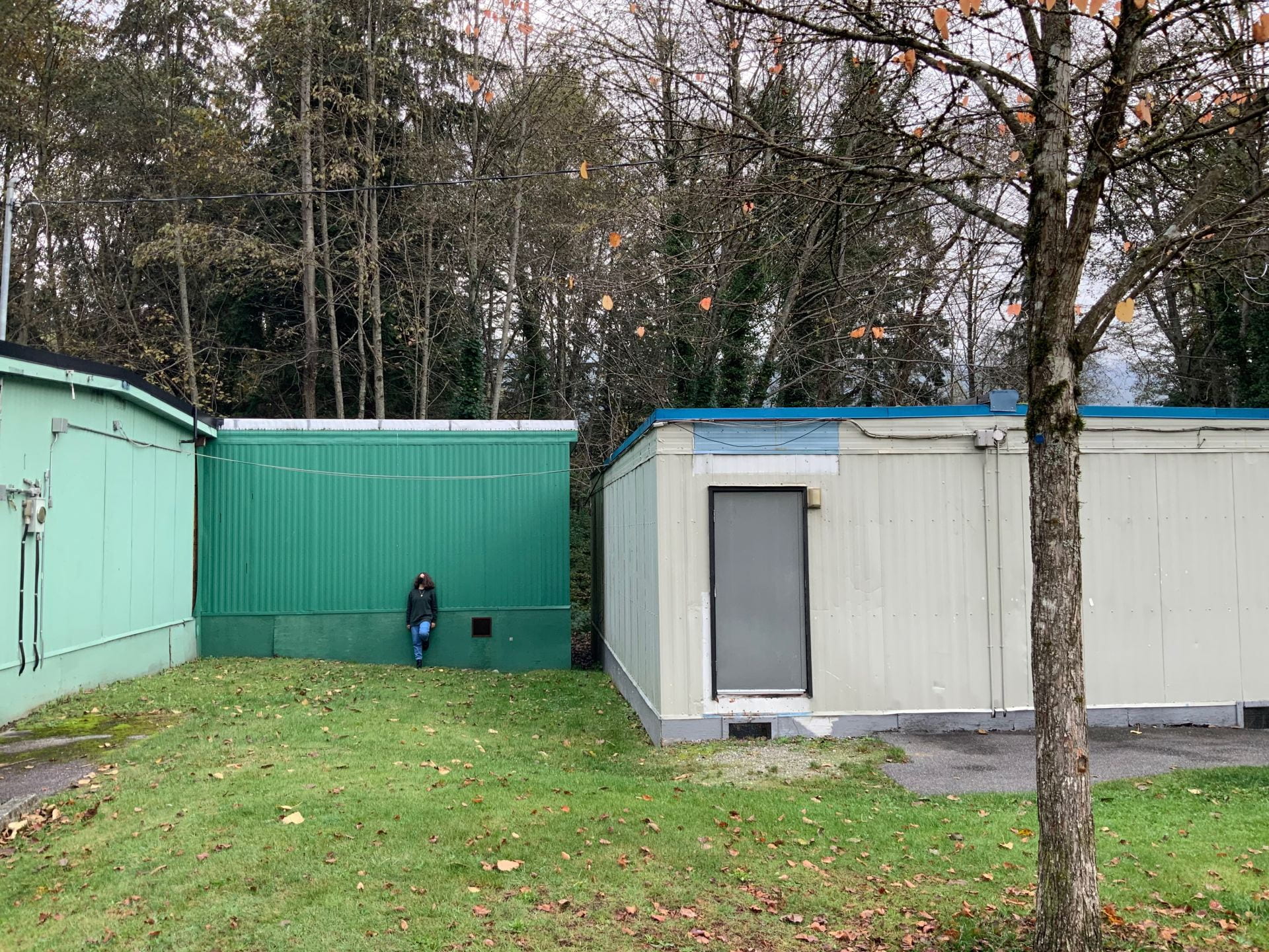
Again, after learning about these tips, we were placed back into our East groups to take some images of our own.
Here are the ones my group took while attempting to use Worm’s Eye Perspective and Long Shot:

Then, we quickly scrolled through other photography tips and tricks that involve other crucial things such as Lighting and even more Camera Angles.
Later on into the Building Knowledge phase, we dove deeper into the definite elements of graphic design. As you might know, a proper graphic design can boost an advertisement to make it even better and share it’s main message far clearer.
As we continue on to actually making a design for our future client, we must know some basics of graphic design.
First off, what is the main thing you want to get across to viewers through this advertisement? Which demographic do you specifically want to target, and how are you going to attract their attention?
We learned that you want to brainstorm these ideas, and the general aesthetic of the company, to create something that will automatically gain attention towards their product or message.
After getting a quick definition of graphic design in an advertising setting, we then moved on to actually learning how to physically “do it.”

To start off, there are 7 Design Principles that can exponentially assist in graphics, such as the following:
- Relationships (visual organizations through making connections between certain aspects)
- Alignment (the organized spacing between the visuals on a graphic to make it visually appealing)
- Proximity (keeping related elements together so that the viewer can tell which visual or text is relate to another)
- Repetition (reusing the same elements or features throughout a design)
- Contract (certain elements/visuals harsh oppose each other to create contrast)
- Space (creating negative space on a graphic that allows the elements room to breathe and stand out)
- Backgrounds (reducing distracting backgrounds and choosing good, simple ones to create balance between all the elements)
In our East groups again, we then created graphics the clearly showed use of one of these design principles.
Here are some graphics that our group created on penguins, while using the repetition design principle:


We also learned about layout and composition, which is very important in graphic design. Even the way you format the text could change the entire message of an advertisement.

You want to have the text placed in a way that it cannot be read incredibly wrong like in this advertisement. You want to have a correct balance of visuals on a graphic that work together to present the message in an appealing way. One way to achieve forcing the viewer see the right things first is to use the Ogilvy Method.
It’s proven by the Ogilivy Method that the things you see in an advertisement are seen particularly in this order:
- The visuals
- The caption
- The headline
- The copy/rest of the text
- The company name/signature
So, most advertisements try to make those first elements more appealing to viewers to emphasize their message clearer.
Let’s move along to the other parts in Building Knowledge where we tried to discover the answer to this question; “What is Media?”
We started off by looking through some definitions of Media, and some other important words related to it overall. Then, we got separated into our West groups, and each team was given a different terms to research.
My group was given Target Audience.
Next, we typed down three definitions that we found on the internet, and one definition that we wrote ourselves based on the general information we found.
Here is what we came up with: media-my-version.pages
Next, we combined the things we learned and created one poster explaining the meaning of this important term to the rest of the class.

We then learned about Media literacy, which can be condensed into five key core concepts:

These concepts can be used to analyze media such as a commercial, movie trailer, tv show teaser, print ad, an internet pop up, and so much more. It was revealed to us that most advertisements try to follow along to these concepts, whether it be consciously or not.
We were placed back into our West groups and analyzed one piece of media, which was provided to us, using the following key questions:

One of the most important things we learned this unit was how to properly utilize Historical Perspective. Of course, we can’t exactly time travel back to when certain opinions were valid and common. However, the closest we can get to this is trying to use a Historical Perspective to look at advertisements and media in order to truly understand their perspective.
But… what is Historical Perspective?
We’ve learned that taking a Historical Perspective is taking a step in the shoes of the people before us. It is putting our current opinions beside us to try to understand or analyze the context which shaped their lives and perspectives before automatically pointing fingers and claiming they were plain “wrong.”
Overall, it’s learning from our past mistakes and moving/advancing forward.

Taking this knowledge of Historical Perspective and the context of Media, we continued on to our second Milestone; Historical Media Analysis.
In this Milestone, we built upon our knowledge that we’ve learned so far about Media, and taking it forward to analyze a piece of media. However, the tricky thing is that we had to choose a example of media from the past, or in other words, “Historical Media.”
Our task was to answer the five key questions of Media Literacy on the media you chose, and write a paragraph that shows what the message was, the target audience, and how the creator presents that message.
I chose to do this analysis on an old World War 2 advertisement calling women to join the War Cause.
Check out my analysis here: milestone-2-historical-media-analysis-.pages

Next, we started to learn about the messages different forms of media can send us, and how to properly show it ourselves.
First, in our West groups, we each made a little poster/advertisement with Sketches Pro that really represents the definition for “advertise”.
Here is what my group ended up creating:

(This is a top quality drawing, simply the best thing I’ve ever drawn)
After learning a little bit about what exactly advertising is, we’ve moved on to look for a little more information from ourselves and our families.
We answered an “advertising survey” which conveyed how advertising impacts the lives of ourselves, and our families.
You can find mine here: advertising-survey-2015.pages
Later on, we then learned about demographics and how the media targets certain audiences which their products. With a worksheet on notability, we reflected on what demographic represents ourselves, and filled out the chart.
After this, we also took a look at advertising techniques and appeals, which can apply to our advertisements later on.
We learned that there is a technical method behind each advertisements and the things they do to appeal to certain audiences or persuade a viewer to buy a certain product.
To get a good understanding and further expand our thinking, we practiced applying these techniques to the media/advertisement we find on live television.
The following images are from my analysis of the advertisements that popped up between my assigned show.


Afterwards, we reflected on our experience and finding from completing the chart: commercial-dig-reflection-questions.pages

Have you ever heard of Pathos, Ethos, and Logos being used in advertising? Because I certainly haven’t before learning about it in class.
We’ve learned that advertisements do use Pathos, Ethos, and Logos to connect with their viewers and ultimately persuade them to purchase their product or ideals
After learning this fact, and reviewing the definitions of Pathos, Ethos, and Logos, we applied it to advertisements we can find in different forms of media. Then, we each individually created a chart explained how that advertisement may provoke those appeals.
Click here to check out my chart: analyzing-ads-pathos-logos-and-ethos.pages
One of the last things we’ve learned before heading off to our milestone is the concept of Herd Theory. This concept has been used by many advertisements, even more specifically in the past when people were more susceptible and unaware of it’s affects on our mindsets.
Herd Theory can be used when advertisers try to appeal to a specific demographic, like teenagers. They try to make them feel pressured to buy a certain product only because it’s trendy and “cool.”
Our West groups were then given a “Teen Herd scenario” where we were the advertisers and we had to convince teenagers to buy a product not necessarily targeted towards them.
Our group was chosen to advertise a suitcase that appealed to teenagers with a lot of pocket money who don’t want to spend their cash on the “essentials.”
Here’s the advertisement we ended up creating:


In this milestone, we were asked to review back on Historical Analysis, however, while also incorporating the things we’ve learned since the last milestone.
Our task for this milestone was to choose an advertisement from the past, and analyze it for multiple things.
We had to take a historical perspective, and explain how modern perspective has changed, or remained similar throughout the times.
Next, we must find the message the advertisement is attempting to provoke, and the techniques and persuasion appeals used.
Lastly, we had to explain the target audience and how the message being shown impacts them.
I chose to analyze a blunt, obviously sexist advertisement from the 1950s.
Here’s a link to my analysis: milestone-3-historical-advertising-analysis.pages

As I’ve mentioned multiple times throughout this post, we’ve each individually created advertisements for our companies. Now, I’ll explain my developing and critique filled process for creating an advertisement for the business we chose to assist.
My North group decided on making an advertisement for many businesses. However, we frankly discovered that our first pick isn’t open during the fall/winter season, and the other business politely refused our offer for a free advertisement.
So, we were recommended to ask a business named, “The Local Lift,” and thankfully, they happily accepted.
To start getting a general idea of the aesthetic of The Local Lift, I created some mood boards with some bright colours and interesting fonts that I found matched their overall “vibe.”

This board was the first one I created. I first used SuperimposeX to create the graphic at the very top, then I exported it to Canva where I also organized the rest of the photos that I found from their website to create this. I tried to give it a homely, rustic aesthetic with the generic fall colours and fonts.

This was the second mood board I created, and I like it slightly more than the first one. For this one, I tried to make it more organized than the last, and used more coherent colours and fonts. I still tried to stick to the homely aesthetic, and I believe it fits better than the first.

This was the last mood board I made, and I tried to give it a slight switch in direction. I feel that this one gives off a more local feel for it represents our surrounding nature and atmosphere.

Continuing on, throughout the unit, we were tasked to first make some individual advertisements for our company.
Although The Local Lift is known for selling delicious smoothies. The owner we spoke to over the phone, Jacqueline, requested that we make an advertisement presenting their warm soup for the winter season.
 Draft 1


Let’s begin with my first one:
In this advertisement, I attempted to draw an visual of soup instead of a photo. However, I’m not too happy with how it turned out.
Some critique I received from this advertisement is that the copy “single up to a delicious cup of warm soup this season!” wasn’t too clear. Probably my favourite part of this draft is the fonts, and I continued to use them in further revisions.
Draft 2:
This is my second draft for the advertisement, and I believe it’s a little better than the first.
One of the biggest things I’ve changed in this advertisement is that I added a photo of soup instead of the drawing. I also made made the copy fit in a small box on the edge of that image.
However, I don’t really like the layout of the image, and the text still isn’t that readable. It’s not that visually pleasing, and I personally don’t really like this one that much.
Draft 3:
Here is my third draft. I almost completely scrapped my old idea and started anew with some fresh ideas.
First off, I used the full image for the background, and created boxes for the text. Also, I kept the fonts from the original drafts, and I kept the logo in a similar place.
The critique I received for this draft is that the copy isn’t too prominent, and could be more readable. Also, as well I didn’t include the location of their restaurant.
Draft 4:
This is my forth draft, and I only changed a couple of things. First off, I changed the font of the copy, and made it a little bigger. Also, I added “Parkgate Village” beneath “The Local Lift”, and changed the spacing a little bit.
This advertisement is also the one of the drafts my group decided to send to our company.
Draft 5:
This advertisement is my last and final individual draft. I barely changed anything despite adding their phone number, and shifting around the text.
To be honest, I’m pretty happy with the result! The only thing I’d change now is the photo since it’s not mine or from the Local Lift’s Website.
Here’s some photos my group took recently for our future advertisement:


Through this project so far, I’ve learned a lot about media and advertising. Although cooperating with a business was pretty far out of my comfort zone, I was happy to have been apart of this experience. It was really cool to make an advertisement for a real life company.
I’m excited to finish this project, and make another advertisement together with the rest of my group.

Gifs are from the following sources:
Star Wars: Revenge of the Sith

Star Wars: Attack of the Clones

Star Wars: A New Hope

Rouge One: A Star Wars Story


Leave a Reply