In Humanities we started of with an advertising unit. To start we were put into groups of four and were told to call a business in Deep Cove and ask if we could meet with them to discuss designing an ad for them. My group (Kyle, Lucy, Taylor and me) were lucky. The first business we called which was the Cove Creek Gallery said yes. After we interviewed them we went to work designing our ads.

This was my first draft. After Mrs Willemse grilling almost everyone’s ads we started draft #2. Some of the critique I got was the background was plain and the visual elements were confusing. So taking all that into consideration I came up with this.
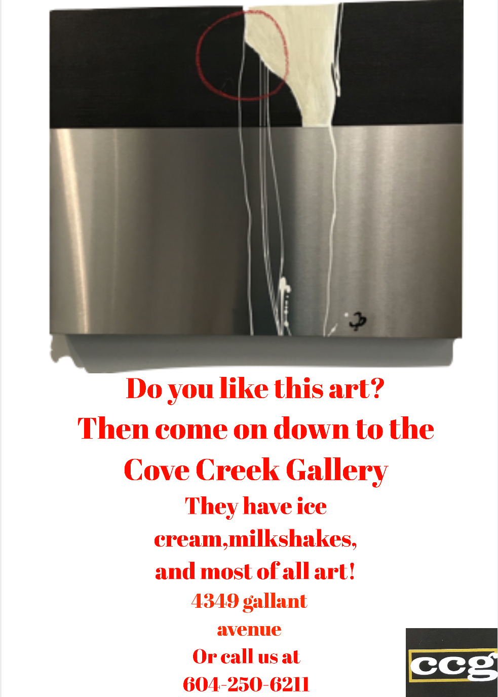 ad draft 2.0
As you can see the ad has changed dramatically. I tried going with a different approach but it didn’t turn out the way I expected. So it was back to the drawing board for the ad.
But right around the time of our third and final ad draft we were introduced to comic life 3 an app for making comics. So my third draft looked like this.
![]() Draft 3
Draft 3
So you can see vast improvement. But enough of local businesses it was time to step it up. On our Oregon field trip one of our assignments was to interview a Oregon business and design ads for that place. We stayed with the same groups, so my group pulled Hatfield Marine Science Center as our business to interview. The person we interviewed name was Athena and she was so nice. She answer all our questions and gave us good advice on what to change about our pre designed ads. Oh yeah I forgot to show you reader it. Here it is
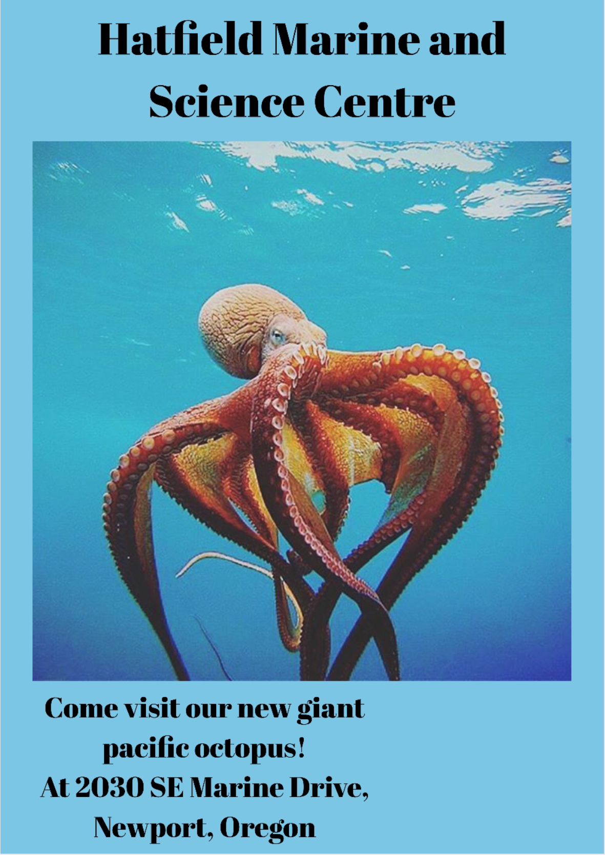 Ad draft 1 Oregon
As you can see its not bad at all its not even close to being do but for a first draft it good. But she gave me some great feed back. Athena said to change the background colour to orange to match their logo. Also to mention that its located behind the Oregon State University. So here’s ad draft 2 for Oregon.
![]() Oregon draft 2
Oregon draft 2
So it’s definitely better but in case you were wondering the background isn’t orange because all the orange colours were to bright or didn’t go with the ad at all. So we got some more critique from Mrs. Willemse. Some feedback I got was there was too much white in my ad so I had to fix that and that the behind Oregon State University whould be gone and to take away the word at. So here’s draft 3
![]() Oregon ad draft 3
Oregon ad draft 3
So there is definitely less white and the spellings fixed. But I still had a bunch to do.

This was my final ad draft after a ton of improvements I came out with this amazing ad.
So that’s it after a ton of revision and improvements the ad was final done. Now reflecting back I would payed more attention to the small little details so that I didn’t have to make any more drafts.
Thank you reader for reading all of this post see you again.
I’m loving the new blog name