Over the last few weeks we have worked on a new project about correlations and causations, we had to survey people and gather data then use that data to create scatter plots to visualize our correlations. At the beginning of this project I had no clue how correlations and causations worked so the first thing our class did was create a mind map on what we know about correlations and what we want to learn/questions we have.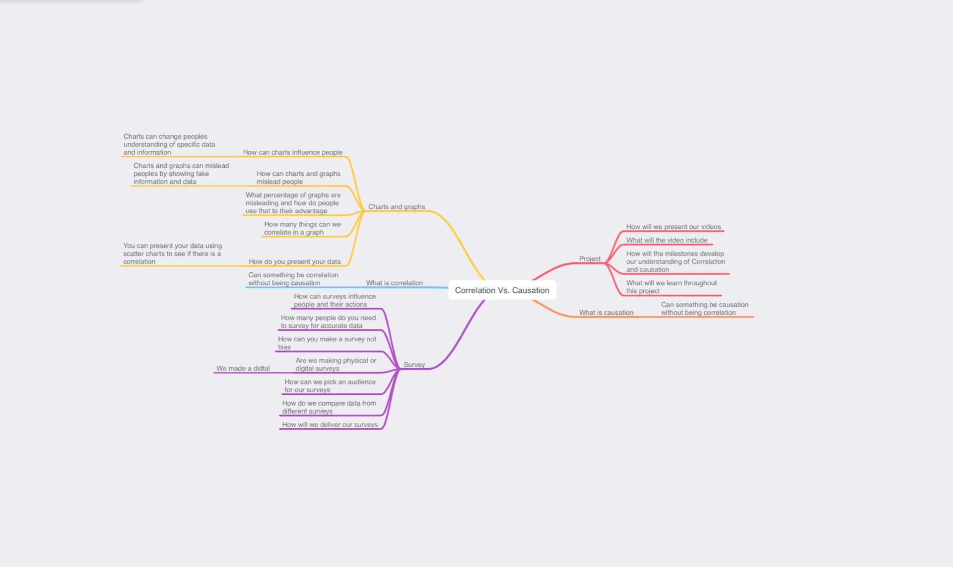 The next few days were all about learning how correlations work, we watched videos introducing them and read text book pages explaining how they work, one of my favourite milestones that helped me learn a lot was milestone 2, in milestone 2 we got everyone’s height and hand size and put all of that data into a scatter plot, our results showed that people who are taller usually have bigger hands.
 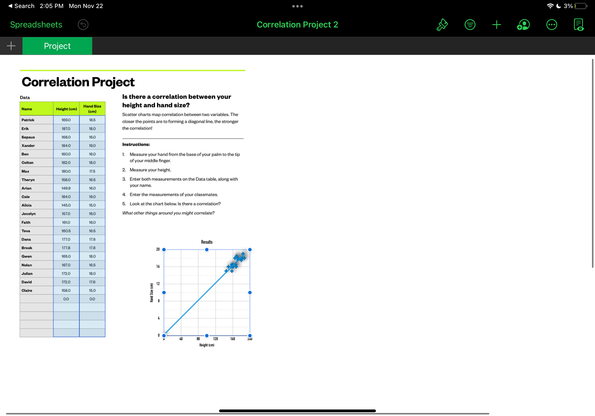 I feel like this milestone helped me a lot because it made me realize how find correlations. Now it was time to create our survey questions, my partner and I decided to base our survey around sleep, exercise, height and injuries and we ended up coming up with 10 questions.
How much sleep do you get per night
How many hours of exercise in total do you get per week
How many injuries do you think you get on average per year
How much have you grown in the past year
How tall are you
How long does it take you to get to sleep
How many days do you exercise per week
On a scale from 1 to 10 how prone are you to injuries
How long have you been exercising for
How many times do you wake up in the night while sleeping.
We only used a few of these questions as correlations as we made 3 correlations in total. Our correlations were
1) We think there will be a strong positive correlation between hours of exercise in a week and amount of estimated injuries you get in a year
2) We think that there will be a positive correlation between your height and how much you sleep
3) for our third correlation we tried to find a correlation between how much exercise you get per week and how much you have grown in the past year. We thought there would be causation but maybe a correlation
After getting our results we ended up having 29 results from numerous grades in the school, we had a small bias in our results as we had 13 out of the 29 answers being from grade 9s, we think we had this bias because we shared the survey with our friends first before putting up QR codes around the school for anyone to do.
As we mentioned before we tried to find 3 correlations with the results we got, the first correlation was between the amount of sleep you get per night and how much you’ve grown in the past year. We both thought there would be a medium or strong positive correlation because your body releases more growth hormones when sleeping which make you grow.
However after putting our results into the scatter chart we found that there was almost no correlation at all.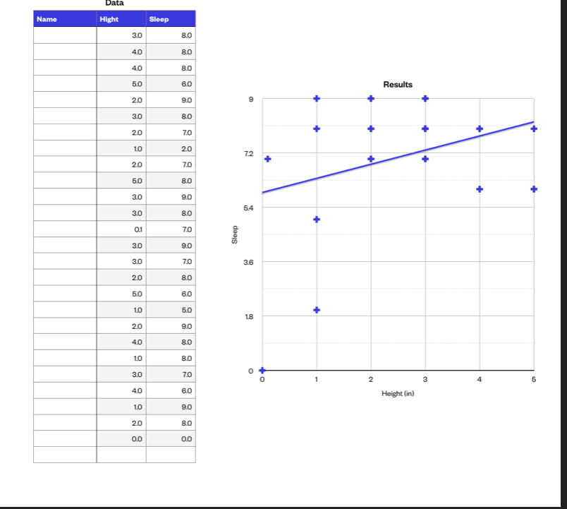
The second correlation we tried to find was between how prone you are to injuries and how many major injuries you get on average per year. We predicted that there would be a quite strong positive correlation because logically the more prone you are to injuries the more you should get.
After putting the results into the scatter chart we found that our prediction was correct and there was a positive correlation.
This correlation also has a clear causation which is, the more prone you are to injuries the more you get.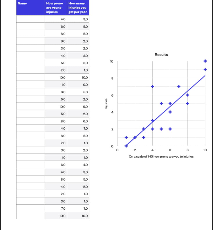
Finally for our third correlation we tried to find a correlation between how much exercise you get per week and how much you have grown in the past year.
We put the results in the scatter chart and found there was a positive correlation.
But this correlation was different, as there was no clear causation. This is because the more exercise you get per week doesn’t effect how much you grew in the last year, and the amount you grew should really effect the amount of exercise you get per week.
Our final presentation turned out very well and we ended up getting an extending mark Our presentation
Planning and conducting: during this project I developed my understanding of many useful tools including scatter plots, google forms (what I made the surveys with), and keynote what I made my presentation in. I accurately collected my data and formulated it in the scatter plots well.
Communicating and representing: I feel like I Adequately showed my use of mathematical vocabulary and language to contribute to the mathematical discussions by showing what type of survey my survey is explaining it in better detail and explaining causation and correlation in my presentation
Applying and innovating: I feel as though I worked well with my partner and overcame problems as a group we split to work evenly and showed our interests and helped each other with our weaknesses throughout the presentation and project