 My first draft

Hi everyone, we have just finished our first assignment this year and I’m here to tell you all about it. Our project was to find a local business interview a manager or owner and create an ad for that company based on what we learned from the interview. My group, Holly, Kaden, Angelo, and I decided to interview Arms Reach Bistro, Arms Reach is a local sit down restaurant with some of the best food in all of North Van. Anyway, our first step was to set up an interview with the business, luckily my family is close friends with the owner so I had his cell number. We were told to create a script for our phone call to the business, but I had already texted the owner about everything and he had said that it was fine to interview him so our script wasn’t at all like the other groups.
But, enough about the script let’s get back on topic, we first decided to call the restaurant’s number to be polite but when nobody picked up we called his cell. He luckily picked up and we decided on a date and time to meet and where the meeting would happen. Once we had the interview set, our next task was to write up questions to ask him. The questions were mostly about how they usually advertise but some of the questions were more about the business. How did you come up with the name? What is your mast popular dish? Do you ever donate to charities, and if so which ones? All of his answers were great they really gave us a lot of insight about the company.
The step after the interview was to start to create drafts of ads we could potentially pitch to the owner as a potential ad they could actually use.
My first draft wasn’t terrible but it wasn’t praise worthy either. Though the picture was nice the words looked like a Canva template. For those of you that don’t know Canva is a online program that is great for creating posters or those hipster Instagram posts that you always see. Anyway, Canva has these text templates that look great but are also really bad to use if you want your work to look unique.
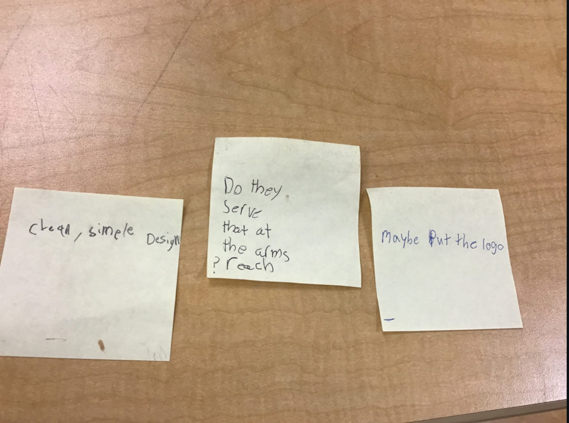
To critique our work we put up our ads on our iPad screen and were given three sticky notes one that had a plus one that had a minus and one that had a question mark. The plus was for a positive comment you had about the ad the minus was for something they could improve on the ad and the question mark was for something you found interesting about the ad. We had to walk around the room and look at the ads and write something down on each of the sticky notes about a classmates ad.

Using the feed back we got from the notes we proceeded to create our second draft. My second draft didn’t use a Canva template for the message anymore but my new problem was the logo was too pixelated. It was also too small compared to the size of my catch phrase, the salt and pepper shakers were also a problem. They were too of center that it made the text look weird. Our critique for this draft was to see if we had used Ethos, Pathos, or Logos. These words are Greek for credibility, feelings and logic and is what ads usually use to grab your attention and make you want to buy the product. I had not used any of the techniques so I wrote down that “For Ethos I will add a message at the bottom saying some thing like “this message is customer approved” or “A message from arms reach bistro”. I could also add EST.2004 at the top.”

Which brings us to the third draft, I personally like this draft the most. I cropped out the annoying salt and pepper shakers, I changed my catch phrase completely to fit the theme of the restaurant a little more, and I added in a hashtag. How I added in one of the three Greek advertising technique is I used Pathos to give a sense of calm and relaxation through the catch phrase. I also fixed the problem of the pixelated logo, I just used an app called font candy, downloaded the font onto their and wrote up the name of the restaurant. I also used a hashtag that I had came up with while making another ad for Arms Reach.
As a surprise our teachers had set up a field trip to a advertising company in Downtown Vancouver called Pound and Grain. Each group had to pick one of the four ads that we had made and show it to the people at the company that had agreed to meet with us. My group chose Holly’s ad as it was one of the best in the class. At Pound and Grain we were shown to their conference room and they gave us a talk about the company and how they advertise and all the different jobs their were. After that they walked around to the different groups and critiqued our ads, the girl that critiqued our ad mostly liked it but asked us to change the font we had used for the phrase to something that fit more with the other fonts.
Once we had gotten back from Pound and Grain we were scheduled to go on a week long trip down to Oregon so the final draft wasn’t due until the following Monday.

To reflect on this project I would like to say that it was much more work than you would expect, it takes lots of deep thinking to create an ad that would appeal to someone in public. The project showed me that those witty ads you see at the bus station probably took a couple of months maybe more to produce, it taught me that creating ads is a long gruelling process that we must learn from to better our next drafts, and that you must always look at your work and think “how can I make this better?” In conclusion I found the project to be fun but I would probably prefer to stay away from the advertising business it just doesn’t appeal to me as a job.