This year our class went down to Oregon for this year’s field study, you can read more about it here. Anyway, while we were down their we were given a company we would be visiting to create an ad for. The process was similar to our Deep Cove ad project, you can read about it here. Though the process was similar it was much more stressful, for the deep cove ad we had about a week to prepare for the interview but in Oregon we had a couple hours. I’m not complaining I actually think that this was a good learning experience for us, it tested our ability to quickly come up with questions to ask using what we learned from the Deep Cove ads.

My group was given Marine Discovery Tours, the tour was amazing but sooner or later we had to conduct the interview. A very nice employee had agreed to talk to us, we already had all our questions planed out and Ms.Willemse had helped us create a structure to the order of the questions all we had to do now was ask. Luckily the interview went pretty smoothly, Ciara was recording the conversation, Felix was taking notes, and Rhiann, Finn and I had the list of questions up so we would stay on track. One of the main things that she said had to be in the ads was that we need to showcase that Marine Discovery Tours is more than a whale watching tour. It is an educational tour that teaches you about the harbour and the whales.

After the interview we were back to the trip, let’s skip that part and get back to the ad. My first draft was pretty good the only thing I would have changed was the fonts of the writing as to make it easier to read. The photo was really nice but I didn’t take it and that was one of the things Ms.Willemse said to change, she also said to add a way to reach them and make the top font bolder.

My second draft wasn’t much better than the first. I used my own image and added a location but the colours I used didn’t compliment the picture. You may be wondering why the picture looks so overexposed, well all the colours in the picture were so strong that to make the text easier to read I had to make it somewhat opaque.

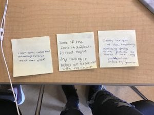
To critique this draft we were all given three sticky notes and on each one we had to write either a plus, a minus, or a question mark. The plus is something you liked about the ad, the minus is something they could improve, and the question mark, it’s pretty obvious, is a question you have about the ad.

For my third draft I made the image even more opaque, I changed the font to make it easier to read and changed the catch phrase so the message was even clearer. The only thing I would have change was he location font and how opaque it looked. Ms.Willemse also had a problem with how opaque the picture was, which brings us to the final draft.

My finale draft was by far the best out of all of them, which is good it means that I did well with the learning process. I had used a great font that was easy to read, I completely changed the image, and I added a little rectangle at the bottom of the ad for the location and the logo. Overall, this project was a success in my perspective. I learned that sometimes you have to let go of your original idea and cater to the needs of the business you’re making the ad for. Hopefully our next project is as fun as this one.


