Making graphic design has always been something I’ve found interesting, so I was excited when I found out we had a whole assignment based around it. While working on these advertisements for Deep Cove Music I wouldn’t really say I had a hard time, but I think I did hit some rough patches along the way.
First draft: Dumpster Fire
I didn’t spend too much time working on this first draft, and I regret that. If this one had come out cleaner, and didn’t look so rushed, I think my other drafts would have been better as well.
I used a blurry image I found online of DCM as my centrepiece, and then put the stores address below. I used a completely white background, which looked… terrible. If there’s one good thing that came out of this, its that I included the store’s logo, which would appear in all of my other drafts as well.
Second draft: A step in the right direction
This draft was far better than my first. I actually put time, and effort into this one.
First off, the background. Although I did pull this image off the interweb, I did my own editing in SuperImposeX, and blurred the image substantially, as to make it look distorted, and the text closer. Then of course there’s the text. This time I used different fonts, and by different fonts, I meant that I used 1 different font. Looking back, I probably should have switched things up, made it a bit more exciting. But it does still look better than my first draft, so I’m fine with that.
Second draft 1.5 : Bonus Content
This probably doesn’t need to be included, but I decided to anyway, since I forgot to in the second draft. In my second draft I included a few pre-made stock images. These didn’t look cheap, and they spiced things up, so I decided to add them. But I thought that in my second draft I didn’t add enough so I made a draft 1.5. I added more text, more stock images, and I included Deep Cove Music’s website, which I should have done before. Everything about my second draft was a huge success compared to draft one, and draft 1.5 just improved upon that.
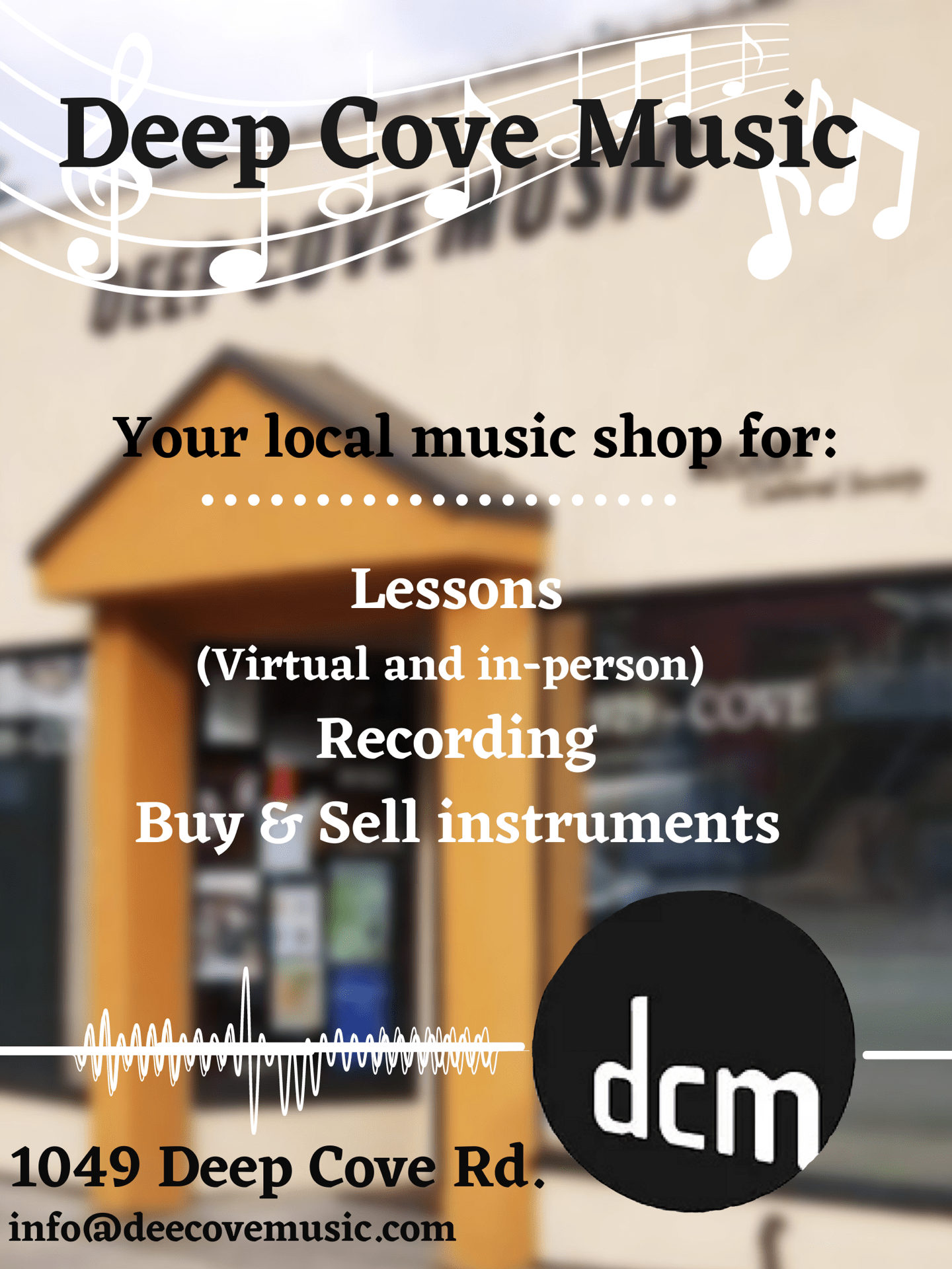
Third draft: Simplified second draft ( Kayak included )
Then there’s the third draft. The one I call my “final draft”, when in reality, there were more drafts ahead in the future. This third draft improved in most places where the second draft lacked. For example, while I was finishing up second draft 1.5, I noticed that I probably didn’t leave enough open space. In fact, I knew I didn’t, but there was no time to change it. In the third draft, I fixed that, by leaving a ton of space open. If there’s anything I should say I don’t like about this draft, its the image. I feel as if its too bright, and that the text just doesn’t feel right hovering up top. Then of course, the kayak. The kayak attracts attention, instead of the text, and up close no one can see what the kayak actually is.
Fourth draft: Identical, but Horizontal
This fourth draft.. didn’t need to happen. This is really just a repeat of drafts 2-3. The only thing it did unique was being horizontal, but did that really need to happen? I feel as if there’s nothing good to say here, I’m just ripping on my own creation now.
Through this assignment, I have realized that graphic designers don’t have as easy jobs as I thought. They constantly have to improvise, overcome, and in some cases, restart. As this project comes to a close, I feel like I (and my group) have presented Deep Cove Music in a good light. I also feel as if I have presented myself in a good light. It hasn’t been that long since the school year began, and we haven’t done that many assignments. This has probably been my favourite project so far, and I hope that this continue in the future.
Drafts below;
Draft 1

Draft 2.0

Draft 2.5
Draft 3

Draft 4
