
Hi there! Today I’m here to talk about things I learned when I made ads! We were doing a project in school where we interviewed a local business and made an add for them in groups that we were divided into. My group consisted of Mathew, Rhiann, and Anthony. Make sure you check out their blogs! We each made our own ad but we did the interview together. This was amazingly interesting because we also went to Pound and Grain which is a marketing agency. They basically make ads for other companies. If you want to know more about Pound and Grain make sure you stay tuned to my next blog posts. I learned 3 important types of advertising, Pathos, Logos, and Ethos. Pathos is when a add targets the audiences feelings to make the audience like the product emotionally. Logos is when you use logic to sell the audience. Whenever numbers are involved you know right away that the add is using Logos. Finally Ethos. Ethos is when you give credibility like saying a celebrity uses a certain product. An ad can have more than one of these 3 and in some cases all of them. Alright, lets get into it.
Draft 1:
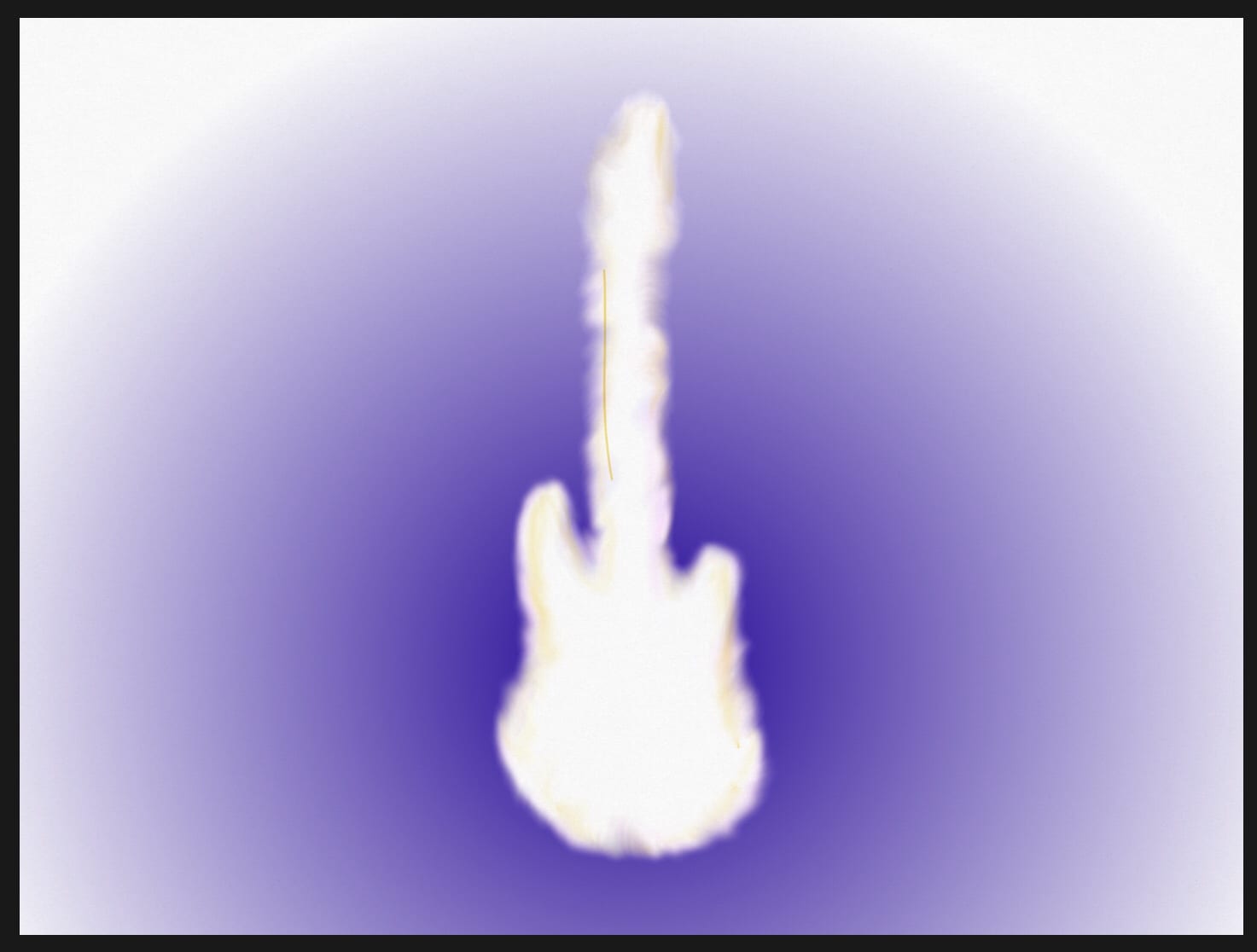
For my first draft I decided to start by trying to set the mood. With the shape of a guitar in the middle that looks sort of like its glowing giving it a Pathos sort of feel. I was trying to send the message that the audience has an unlimited amount of potential if they went to this place. On this one I forgot to ad who I was advertising for and how to contact them.
Draft 2:

For this draft I used comic type lines to draw the audiences attention to the centre. The lines also give it more impact and doesn’t bore the audience to much. I would definitely try to stay away from blank spaces because it makes the ad look unfinished. This is one of the many things I would do differently.
Draft 3:

On this draft I changed the colour to give it a more cheerful feel but didn’t change anything else.
Draft 4:

I decided that I didn’t like the colour in draft 3 so I changed it back and added a guitar to the centre to give it more of a kick. I added a catch phrase so that you can really get what I’m trying to say. I have added the company logo and address so that you can access them. I also added some chains to sort of imply that you can really unlock your potential because it is currently hidden away. You may note that all 4 of these drafts are all drawn out. This is something I will go into more later but I would like to say that I would definitely not do this in the future if I were to do this again.
Draft 5, final:

This is where you can really see the difference. As you can see, I have digitalized everything and completely abandoned my original format. I used a catch phrase and tried to clean things up a little better than the other drafts. The logo is visible and so is the the address. You can see the name of the business I’m advertising for and everything is readable.
After looking at my work I have decided that for future reference, I will defiantly start digital because it s easier to revise that way. Honestly in my opinion, my first 4 drafts would probably be in the planning stage and my final draft would be like a first draft. I think that it took me a really long time to let go of what wouldn’t work. I will defiantly keep this in mind if I am to do this again. So, this now draws me close to the end of my little self reflection here. Please comment below and tell me which one you liked best and why. I’ll see you next time!
Hey Meg it’s Ben and my favourite ad draft would be the third one. The colours and the theme just pop and I love it. You said that you drew the first 4 ads. Did that include the guitar in the fourth ad draft? If so it is very good!
Thanks for your comment, i did draw the guitar in the fourth ad but not in the fifth add. Do you like to draw?