
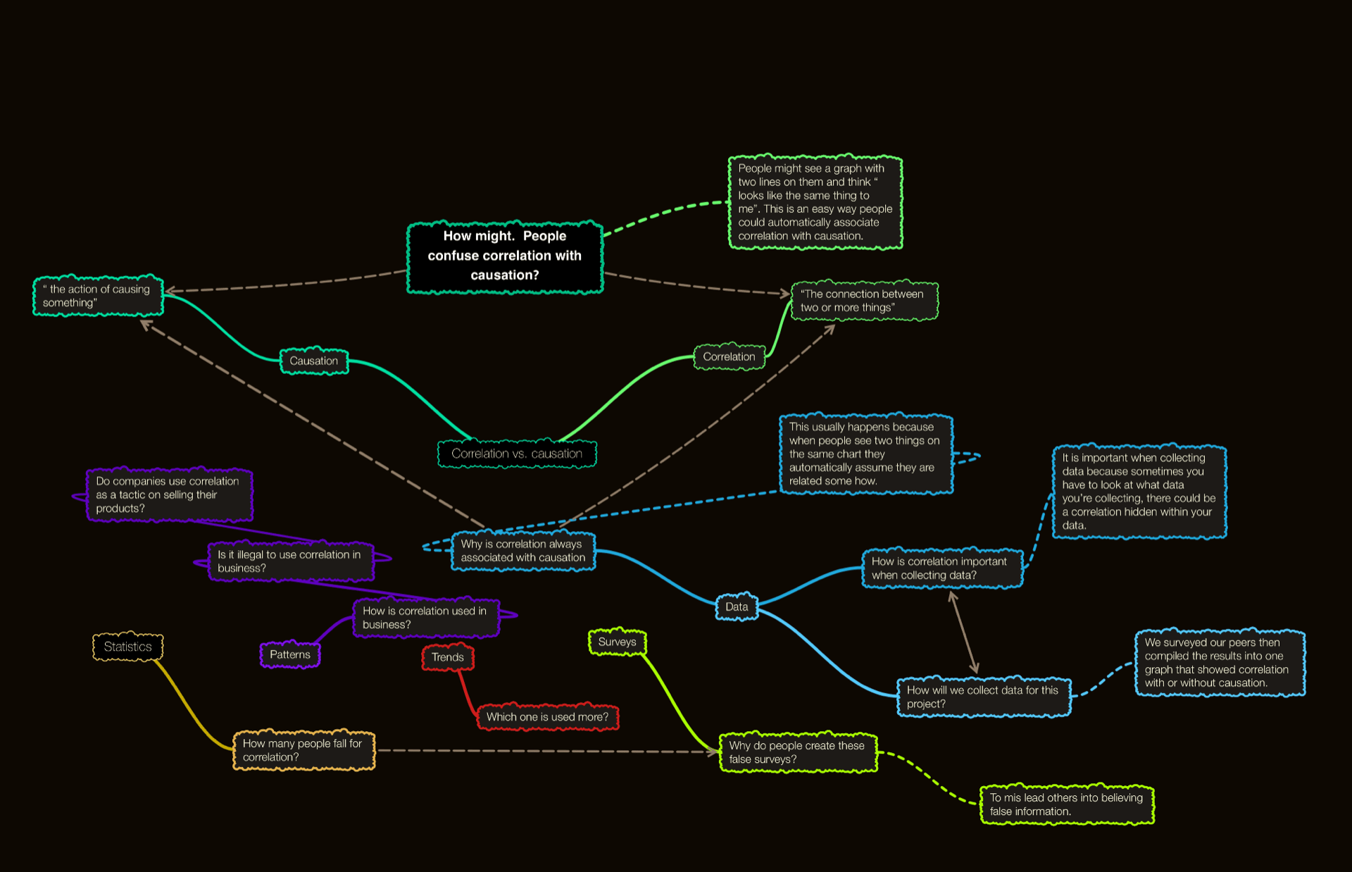
Today I will talking about the Scimatics ( science and math) project that I have just finished. We learned all about correlations and causation and how to tell them apart from each other. At the beginning of the project we filled in a mind map showing what we knew or thought about correlations and causation, here it is.

You will notice at the end of my post how the mind map will have change because of all the new things I have learned about this topic
With all that in mind, I will be sharing what and how my partner and I successfully thought of a main question, created a survey, got results, and put them all together in a presentation to show how correlation and causation are two different things and can easily be falsely associated with each other.
To start of we had to create a lot of questions that we could ask our class, these could be really random questions but we had to be able to take two of them and them show a correlation with or without causation within them. This might sound really weird but it was’t so hard once we created the questions and surveyed the class. Our first questions were angled toward screen time and daily physical activity, we asked questions that would relate to both those things, when gave many options so that we could pick at least two of the questions to go into our final presentation. Then the second set of questions was angled toward popularity online and each persons dependence on their phones, these questions were simpler so that we had more time to look through each one and find a correlation or causation faster.
We compiled the data and specifically looked at these results.
One of these is a correlation with causation and the other is just a correlation. I’ll just tell you now that the daily physical activity and the screen time one is just a correlation, which leaves the popularity online and dependance on phone to be the correlation with causation, but why is this one the one with both, well I will explain that now. As seen in the first graph the line shows the trend and since the line is going up as each of the X and Y axis go up, it shows that more screen time equals more daily activity, and that doesn’t make much sense leaving it to be a correlation with no causation. If we had the time to alter the question or looking deeper into some other results, maybe there would be a chance that we could find a causation in this survey.

In the second graph however the trend line if more clear showing that as popularity online goes up, so does time online. This one would make sense because as people become more and more popular online, it would safe to assume that the time they spend online would go up to, they are spending more time online because others are encouraging them, therefore making them popular. That’s my explanation at least. I think though I could have presented a stronger reasoning which is something that I will work on in the future.

Now that we had all this information we were able to put it all into a presentation to show our class. In my opinion our presentation could have gone better, there could have been more facts to backup or reasoning, but it was still a successful presentation none the less.
We believe the survey shows people how screen time can alter based on “popularity” and things like that and we hope people got some sort of new understanding from our data and presentation.
Just to wrap this up here is the new mind map showing a greater understanding to some questions I couldn’t answer at the beginning of the project.
I hope this post was enjoyable or taught you something.
That’s all for now