Project Reflection
Introduction:
This project has taught me a great deal concerning graphic design. Before this project I only knew a few details about the subject of advertisement. I knew Pathos, Logos and Ethos however, I didn’t know there were different types of advertisement techniques and I didn’t know how much work goes into making an good advertisement. This reflection will most definitely not include everything that I learned in the project due to my terrible memory. The advertisement project I did at my old school usually concerned more of how good your advertisement appear and analyzing advertisement. However, we were never given the opportunity to make an advertisement that will in the future go online and advertise a real life business.. Overall, the next time I do a project similar to this one I’ll try to work on following the guideline more closely.
First Step With Design Group:
Our teacher at the start put our class into nine different groups in order to make an advertisement. We had to choose one business and make advertisement for that business. This advertisement the business would put online to promote their company. However, we could only choose a business near our area and a business that would agree to us creating an advertisement for them. At the start of the project we have three options. We decided on four potential businesses that were in our area, Honey, The Raven Pub, a shop Music and A’hoy. We chose The Raven Pub because of it’s delicious food advertisement. After deciding a business we later had to decide on how we were going to present our advertisement. We made an online mood boards in Numbers and filled with pictures of their food, restaurants and just pictures of crows. I contributed a few creative pictures of crows since before the project I drew two different pictures of crows. One was a crow skull and the other was a black and white crow. However, I didn’t choose either of them in the second draft phase. In this phase of the project I think we could of done better at teamwork and each of putting the same amount of effort in the project. I think we did really well on just how many ideas and photo each person in the group contributed to the Mood Board. The next step was to make our very own advertisements.
Building Knowledge:
I learned many different techniques, appeals, and ways to design my final advertisement. Thought worksheets about techniques and appeals I learned the names for the ways people try to advertise their product to you. Additionally I took several notes on the importance of opacity, spacing, contrasting colours and the emotion your choice of colour will give to the audience. One thing I think I could of improved on during this process is checking with my notes concerning advertisement that I am using the techniques I learned for advertisement. However, an aspect of the project I believe I did well on taking notes and understanding the core of what they were trying to teach us. Theses skill will help me in the future better understand different advertisements.
Draft number one:
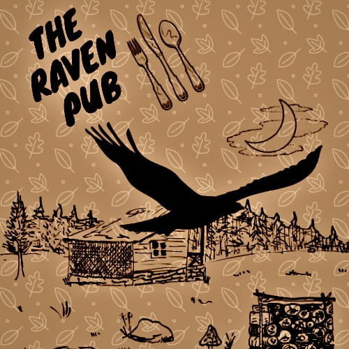
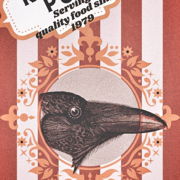
I had a great deal of different types of ideas for the final advertisement. My first idea was to use my crow drawing to make an advertisement. I incorporated two of my raven drawings that I created in Pro Create for my first drafts. Additionally, I made one draft that I wanted to look like you were going to the carnival known as draft three and another draft that I wanted to make look more naturalistic know as draft two. I was more focused at the start to make my advertisement visually appealing at the start. After we were finished the draft we had to present to our Design/Photo group know as our East group. I should of at the start tried to make my advertisement use more words to convey the techniques or appeals of my advertisement. One feature I did amazing at in this stepping stone is trying different ideas to see which advertisement fits my business the best. However, I was disappointed that the pictures that I incorporate my artwork in didn’t look as appealing as the advertisements made fully in Canva. In general, trying multiple ideas helped me figure out what I wanted in my advertisement.
Draft number two:
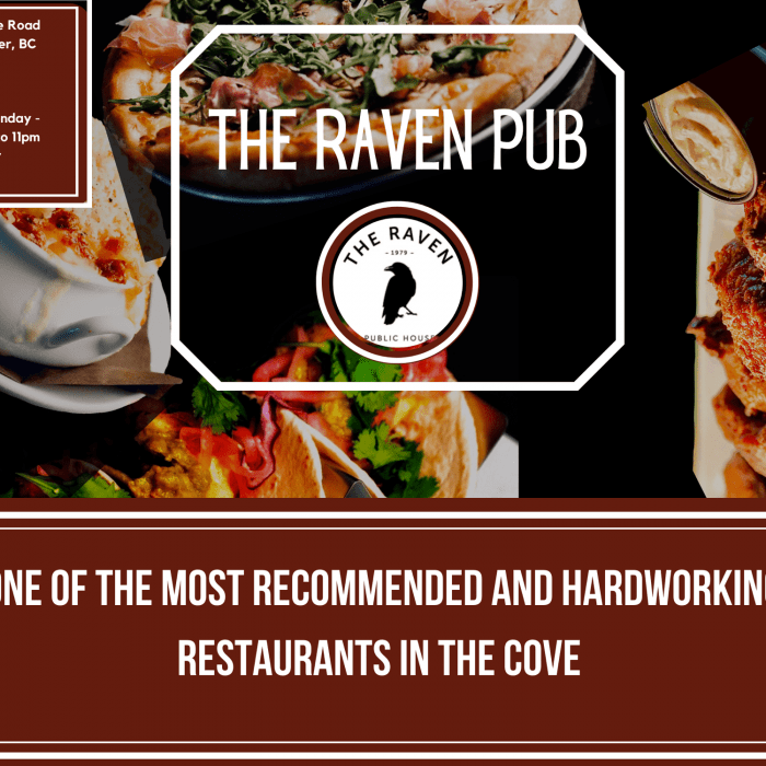
My next draft were very different from my starting ones since I knew much more about what should be in my advertisement. By this time in the project I learned multiple techniques, how to correctly use images and how to use photo editing apps. I kept two out of four images from the last step, the carnival like advertisement and the advertisement with the cabin and the crow. I added a call to action in each one of them using the technique of “Sense of Roots’ by stating that The Raven is in Deep Cove or that it has been in Deep Cove since 1979. Additionally, I thought that my advertisement were too visually based and I should make an add that advertises the food of the restaurant. That is why I made a new advertisement on Canva showing all the different types of food The Raven Pub serves known as draft five. This advertisement took an extremely long time to edit since I had to take each photo from The Raven website and cut out all of the background. I used Pro Create in order to do this and overall I did a decent job in cutting out of the background images in the end. I decided to use MindNode, an photo editing app, to edit my photo too look more entrancing. I made my carnival advertisement look like an advertisement you find in the 1960s to make it look more unique and eye catching. I also added more saturation to my natural looking draft and made the food in the fifth advertisement pop. The critique I got was to make the my draft third have more easy to read captions. I think I could of improve on giving more criticism to other people drafts and asking more criticism for my own draft. One thing I did well in my opinion is using MindNode to improve the overall quality of the advertisement. Overall, this step is the step where I put the skills I learned from my teachers into the project.
Draft number three:
I’m very proud of how each of my third drafts turned out. To make some of my text more readable I made my third draft have a background for all of it’s text. I additionally added the location of the restaurant since I though we needed the email for the business in my previous drafts. I also change some of the text to look more pleasing to the eye and to complement the background. At the time I was very proud of my work and happy that I put the effort to make three different advertisement at once. One thing I could of improved was change the logo of The Raven Pub to better balance the appearance of the picture. Additionally, I really did a good job in taking the criticism my group gave me and applying to my advertisements. In general, I’m really glad on how I was able yet again to try new ideas.
Final Drafts:
For the final drafts we had to meet with our design groups. This group gave me much more feedback than the my original group. Even though their criticism made me fell worried about my designing skills, their critics helped my advertisements become even better. One of the criticism they gave me is to make my third draft is that I should make the draft less creepy. I did this by editing my third draft on MindNode to look more rustic, golden and plain. For my fifth draft they informed me that I should move the placing of my words because they were in front some of the other important pieces of the draft. For this part of the project I improve on as I have said before using the criticism someone gave me and applying it to my drafts. After giving criticism we were meant to choose our top three advertisement in our group, my fifth draft got chosen for one of them.
Revisions of Final Draft:
The revisions of my final draft is mainly based on my own criticism of my draft. This is mostly because my business hasn’t replied to our email at the moment. The first thing I change was the size of my advertisement thus I could add the times you could come to The Raven Pub. Another thing I change was the font since I thought it didn’t look like the font The Raven usual uses on it’s website. Moreover, I included the words satisfying and hardworking to state to the audience that the raven is a rescue at that cares deeply for the happiness of the customers. I also changed the colour to a darker red because it look more mature and I believe it would better target the targeted audience of adulting in their thirties. Overall, I’m happy with how my draft turned out in the end and very nervous to hear feedback from our business.
Conclusion:
I believe that I did an adequate job for this project. When I look back on my project I’m happy on how everything turned out at the end and I’ve learned so much about decoding advertisement and making my very own advertisement. However, one thing I wished I experimented more on is using words instead of visual to convince people to buy my advertisements. One feature of the project I personally struggled with is giving criticism since I have a hard time saying a part of what someone has made is bad because I feel like this may offend that person. I should spoke more openly and be more confident. Additionally, I think I amazing in visually appealing to the audience because of my experience with art. Overall, I loved this project deeply and I’m hoping to see more project like this one in the future of PLP.


November 13, 2020 at 6:48 pm
hi sabrina! i really really enjoyed this post. i loved how you went through the process, talked about the LAUNCH cycle, explained all of your drafts and revisions, and have given the reader a very good explanation of the project. all of your ads look very visually appealing!! awesome job sabrina!
November 29, 2020 at 3:46 am
I like how thorough this blog post is. Also, that cat pun is hiss-terical haha!