Hello people!
In the past few weeks, I have been working on a project called “medium is the message”! It has been a fun and interesting journey going through this project. While doing this project, we did many mini milestones and one big project (our advertisment).
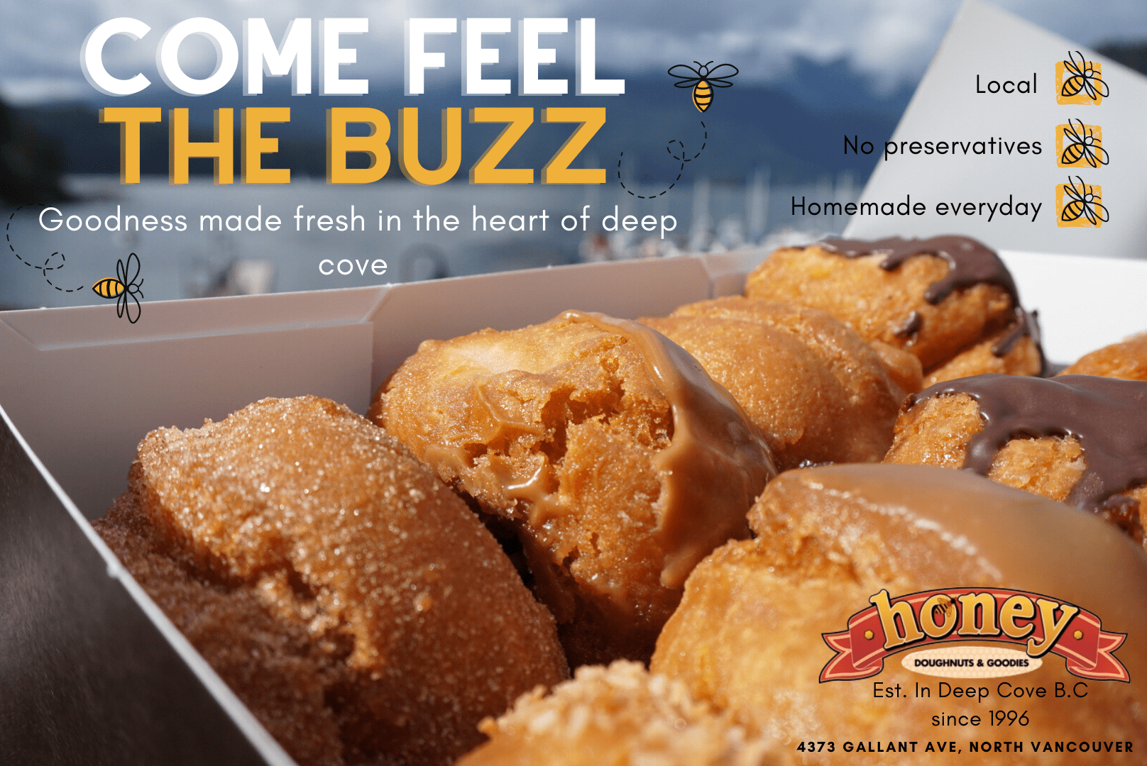
Our final group ad.
My other group members that help make this ad:
The driving question:
How does what we hear, see and read influence us?
My first creative media:
 This was my first draft that I created. It took me approximately 1 day to create.


The big project was to create an ad for a randomly assigned company. My group and I, was assigned to a company called “honey doughnuts”. As you can see above, those were my different drafts I made for our company. When you continue to go through the different drafts, you can progressively watch as the improvements of the ad. In total, I created 4 different drafts.
The first thing that me and my group did, was to contact the owner of Honey’s doughnuts to ask her preferences for the ad. After interviewing her, I created my first draft. The first ad I created had a simple background consisting of yellow, brown and black with the doughnut having a bad transparent background. I also drew my own bees using an app called Procreate. When I did the second draft I changed the background colour because I found that the black and brown did not really fit with the aesthetic. Also, instead of using instant alpha that keynote has installed, I used the transparent tool that Canva provides so that the donut’s background is fully transparent without any weird dots on the screen. On my third draft, I decided to remove the red circle behind the doughnut because it was diverting the attention of the reader. While making the third draft, I made sure to add all of honeys doughnuts contact information and that the doughnuts had no preservatives, fresh and was made with free ranged chicken eggs. After getting critique from my teacher, I revised and tried again. I finally created my final ad that I though was pretty good. I changed the bees and shortened the text that the bee said. After finishing my individual ad, my group and I proceeded to choose 1 ad out of all of us. Unfortunately, my final ad did not get picked to be sent to Honey doughnuts. After deciding what the final group ad was going to be, we got professional feedback from a real advertising company on the ad. When we revised the ad after getting advice from Mr Hepburn (the owner of the advertising company) we sent it of to Honey’s doughnuts. Unfortunately, she has not reached back to us. In conclusion, I learnt many different advertising techniques and how I can create an ad if I needed to in the future.
My second creative media:

On top of this body of text is my advertising photo journal. I had to travel to different places like down town so that I could take photos for this media. I found it quite interesting going to different place while taking photos for this media because I do not usually pay attention to ads I drive by. All in all, I found this project pretty cool.
My third creative media:

For my third creative media, I had to analyse an video advertisement made by apple. This was our first real milestone for this project since joining PLP. This ad was advertising a product called “the home pod.” I had to talk about the different aspects of the video was like who the target audience for this media is for, what the message they were trying to send and how they used that message to reach the target audience. I really enjoyed watching the video and found it very intriguing. If you want to watch the video, here it is below:
My fourth creative media:
Design Principles Workbook Medium is the Message view
Before, creating our individual ad, we were given a workbook of different advertisements techniques. It also included areas to try the methods that they displayed. It taught me many methods for the project. These are some terms I learnt:
The first term I used was relationships. It means making connections between colour, patterns, shapes and text. I implemented this term into my individual ad by using colours that fill well with each other. The next term I used was alignment. It means that everything is evenly aligned and is spaced well. I utilized the term by evenly aligning all my photos and text well. After that, I used another term called proximity. Proximity means to make your ad easily interpreted. I think the ad I created is easily distinguishable and can instantly tell that I was advertising a bakery because I had a big photo of the donut in the middle. The last term I used was contrast. Like relationships, it means to use nice colours that fit together. I used a nice bright yellow to represent honey and white to contrast it.
In conclusion for this project, I learnt many new terms and how to create a proper ad. I found it very fun and would enjoy to do it again. Some things I think I did well was creating my final ad. I made sure to include all of the requests made from the Honey Doughnuts owner like that the doughnuts were fresh and had no preservatives. The colours I picked out also fit well with the aesthetic. I also added a honey comb background on top of the yellow so that it was not to empty. Some things that did not go so well was the interview with Ashifa (owner of honey doughnuts). My iPad kept on disconnecting during the call when I was talking because of some weird tech issue. I was quite embarrassed to miss most of the interview and apologized to the honey doughnuts owner through the chat.
What I took away from this project: I now know different techniques used for advertising and how to create an ad in the future if I ever need to. If I every do it again in the future, I think I will probably use the same idea as I did for this ad but ad more doughnuts to show the wide variety of flavours that Honey Doughnuts has. I now know that what you hear read or see can really influence our choice of decision. Subconsciously, if you see something that looks aesthetically pleasing or eye catching, you are more likely to notice and might subconsciously remember it. This makes it really important when making ads because you are trying to sell something.
Unfortunately, this is the end of the blog post. I really enjoyed creating it and hope you enjoyed reading this blog!
-Chris
Awesome