
Draft 1

Draft 1 v2

Draft 2

Draft 2 v2

Draft 3
Draft 3 v2
Above: My advertisement drafts
When we started our project, we were put into groups that each had a different purpose. Our North group was our project group. Our East group was our Design/Photo group. Our South group was our analysis group and our West group was our advertising group. Our entire project was based off of working with these groups. We did most of our work with our North groups and they were the group we would always come back to. We were told we would be making an advertisement for a business and we were asked to write down some need to know questions.
We were also assigned to read The Gospel According To Larry. Personally, I didn’t really enjoy reading the book, but it was quite interesting.
In our North groups, we chose a business that we would reach out to, and contacted them to ask if we could make an advertisement for them. My North group chose The Raven Pub. We decided on some criteria that our ads would have, and we stuck with them throughout the whole process.
For my group, we decided that we would have an orange and purple colour scheme, a rustic style theme, we wanted our ads to appeal to people aged 30-70, we wanted to focus on being a part of the community, we would incorporate a raven into our design, we wanted to have big text for our caption, and we wanted an “eloquent, old layout” for our design. Along the way, we put more emphasis on some criteria (such as the rustic theme and focusing on being a part of the community) and less emphasis on other criteria (such as appealing specifically to people aged 30-70).
We got our ideas for our criteria from E-mailing The Raven Pub directly. It was really cool to get a professional business to E-mail you (or at least your group) back.
For most of our first drafts we had a lot of badly used white space and not a lot of important things such as pictures and text about different important details of our business. My fist draft is extremely aesthetically displeasing, and I am very proud of how it transformed over the course of the project.
We learned a lot about graphic design and photography, and watched some videos too. One of the videos we watched was an ad called “Welcome Home”. It was made by Apple, advertising their Home Pod. We were asked to write about it and talk about the message and whatnot. I think I did quite well and I am proud of my review of the ad.
We were also asked to review a few historic ads. Come to think of it, quite a bit of this project was talking about different ads. I am also pretty proud of my review of the historical ads. Specifically my review of the “Red, White and You” Coca Cola ad.
Here is the review:

This ad was made by Coca Cola and seems to be targeting Americans. Specifically Americans who are patriotic. They say “RED WHITE & YOU”, which rhymes with red, white and blue, which are the colours of the American flag. Red and white are also the colours of Coca Cola. This could also be targeting basically every other country in the world, because every country other than Jamaica has red, white, or blue in it’s flag, but “red, white and blue” is typically used when describing the American flag. By switching out ‘blue’ for ‘you’, they are suggesting that by drinking Coca Cola, you become a part of America. This ad is advertising “Coca Cola Classic”. The ‘Classic’ label was given to distinguish the original Coca Cola from the very unpopular ‘New Coke’, which was a gigantic fail. The ad also uses a red and white colour scheme. Even the paint cans on the platform are painted red and white to resemble Coca Cola bottles. New Coke was introduced after tests found that consumers preferred Pepsi over Coke, but New Coke got a negative response from the American public, so it is no surprise that this ad is targeting Americans. By showing a regular looking guy painting the ad, it suggests that Classic Coke is for regular people, more specifically, working class (patriotic) Americans. To condense that, this ad is encouraging Americans to drink (classic) Coca Cola. Since New Coke is (thankfully) a thing of the past, the issue of advertising regular Coke no longer exists. However, we still have the issue of advertising to the American market. When this ad was made (1986), using patriotism to advertise to Americans was still something that a lot of companies did (and sometimesstill do). Now, celebrating American patriotism isn’t something heavily used in ads anymore. This shows that being patriotic isn’t as popular as it used to be. In conclusion, this ad targets the working class American population, by suggesting that drinking Coca Cola is something that is integral in being American. This was something that would have worked well in 1986, but probably would not work as well today.
Sources
Wikipedia
After we finished our first drafts of our ads, we came to school and we critiqued each other’s ads. With that critique in mind we went home and created our second drafts. I didn’t do much in my second draft, apart from changing the text colour of my title, and touching up my Raven logo. We did the same thing again and with more critique in mind, I basically redid my ad. I changed some of the text, changed the text colour some more, and I added a QR code that, when scanned, sends you to The Raven’s online menu. I don’t know why, but I am very proud of the QR code.
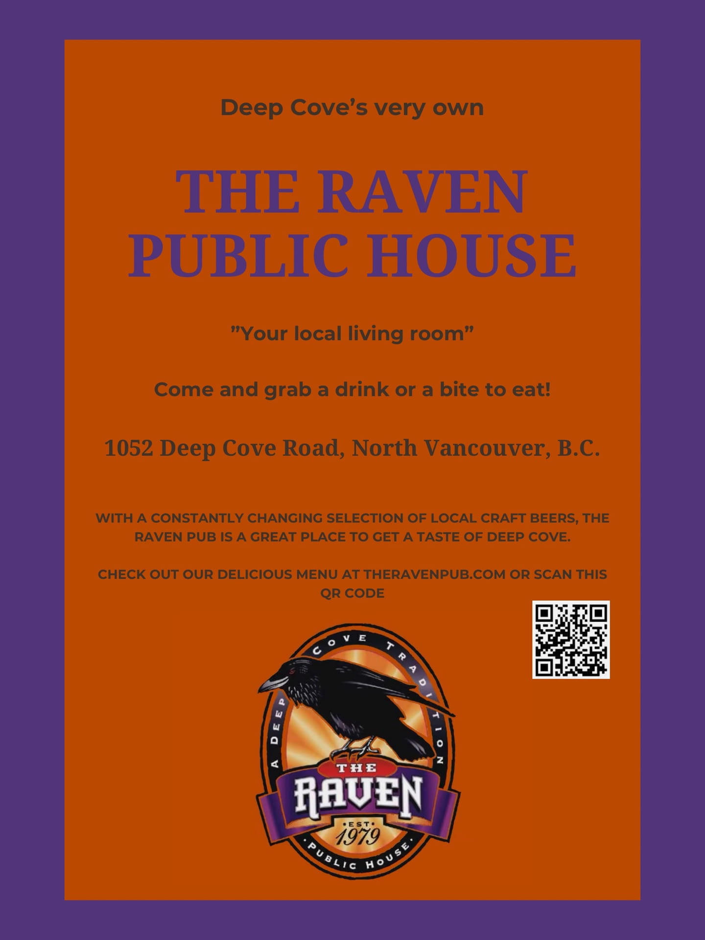
lastly, we were asked to take all of our critique into consideration, and create another ad that reflects the message you are trying to get across and takes what was good from your third draft and makes it even better.
Here is mine:

I am quite proud of this one.
If you decided not to read this whole blog post and just scrolled down to the bottom, I’ll condense it down for you. We were put into groups and made advertisements for a certain business in Deep Cove (my group did The Raven Pub). We did multiple drafts of our ads after getting critique from our groups. I am very proud of my final draft and I feel like I changed quite a bit of it (for the better). We also read a book that I didn’t enjoy, and we were asked to review some historical media and modern day ads and whatnot. I feel like I did a really good job on that, too.
Ok, I hope you enjoyed reading this. See you later!
-Dylan

Leave a Reply