In this unit, we looked at fractions. Now, typically I don’t like fractions. I just find them confusing and sometimes a little excessive. For our project, we were asked to keep track of our screen time and make some charts about our screen time usage. We also did some quizzes about fractions.
When we started the unit, I was struggling with fractions, but now, about a week later, I feel much more comfortable with them. I had a couple of lightbulb moments over the past few days, and I have cleared up some confusion that I had with what I have called “my least favourite type of math”.
Understanding and Solving
We made spreadsheets in Numbers keeping track of our daily screen time and calculating our total screen time. The driving question was “what is your average fraction of screen time per day?”. For me, I usually got around nine hours and thirty-eight minutes of screen time per day, or about 39% of the day. I would really like to lower this average to at least 7 hours of screen time or less per day. I will link my Numbers document here:
https://www.icloud.com/numbers/0ToE7FuVu5xkjVhLJrvAEfDXQ#Screen_time_tracker_2020_p4
Applying and Innovating
In this project, I used my time efficiently and focused on the task at hand. My table partner Santi and I worked together a lot on the homework and he was a great help when I was confused, as somehow he understands fractions. I also helped him a bit with some of the Numbers stuff, because Numbers is sometimes a bit confusing. He helped me feel more comfortable with fractions, and I feel like in the last week, I have learned quite a bit about fractions and I am twice as confident with them as I was before. Here is his blog if you were curious:
http://www.blog44.ca/santiagov/
Communicating and Representing
We made a few pie charts, line graphs, etc comparing our screen time with other things such as our total off-screen time. Another thing I feel more confident with is Numbers. When we started the project, I had almost no knowledge of how to use the program, other than the LAUNCH journal I had made with my North Group in my last project. Now, I feel comfortable with making charts, customizing spreadsheets, and adding and comparing sums of data. Here is my pie chart that shows how I used my screen time:
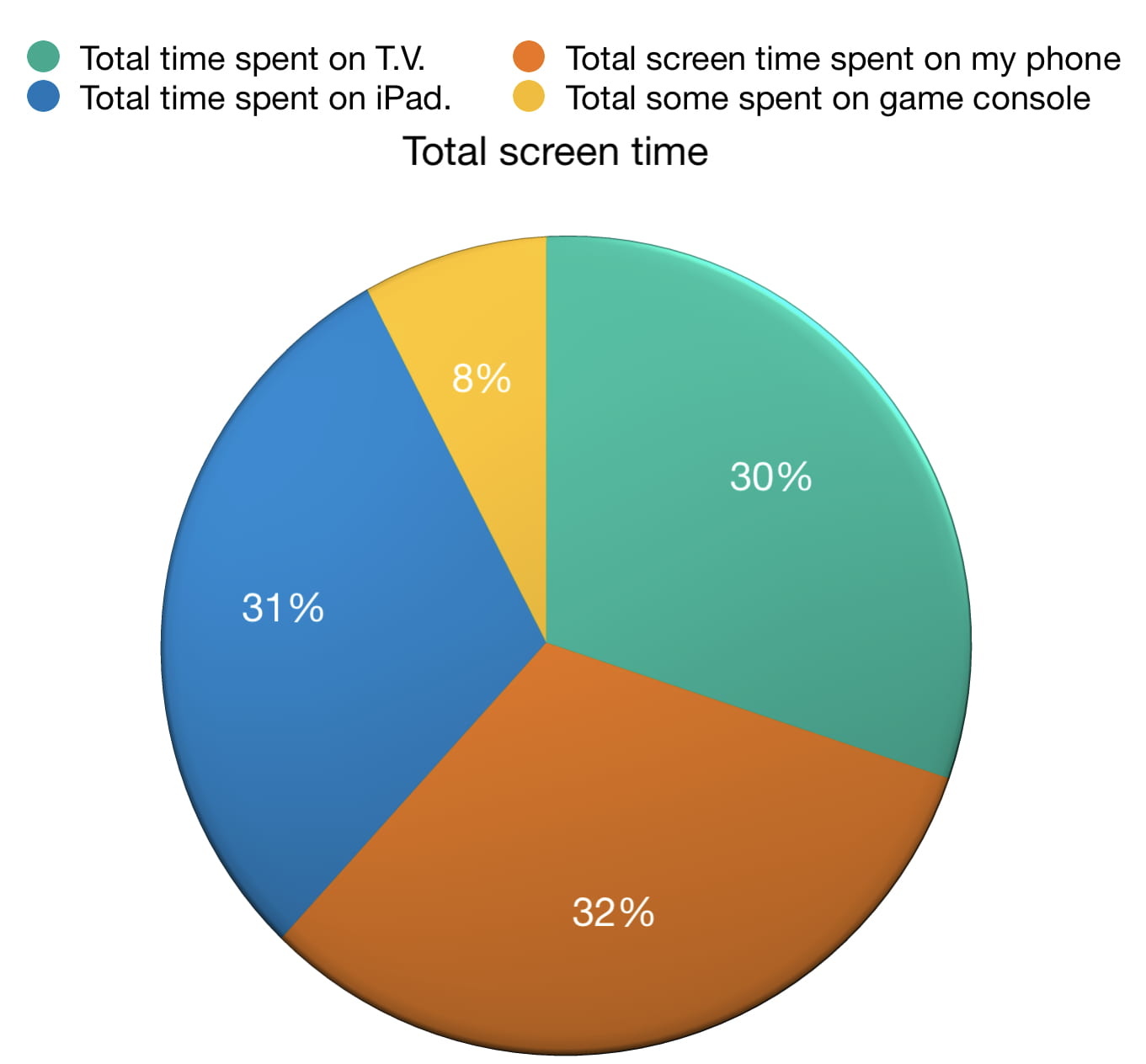 I was surprised by the fact that my phone use was the most. I thought that I would have spent more time on my game console or T.V the most.
So in conclusion, I have learned a lot about fractions, I feel more comfortable with Numbers, I worked well with my table partner, Santi, and I was able to correctly answer the driving question.
I hope you enjoyed reading my blog post which 484 was words long if you were wondering, and I’ll see you next time!
Bye,
Dylan

Leave a Reply