
 Second draft
Hey guys I’m back!✌️Today I’m going to talk about an ad I made in Oregon. I made ad for a place called Northwest Trek. It’s a Wildlife park in Washington. My group and I went to their offices and interviewed one of their employees. We asked her questions about the business and what they would want an advertisement.
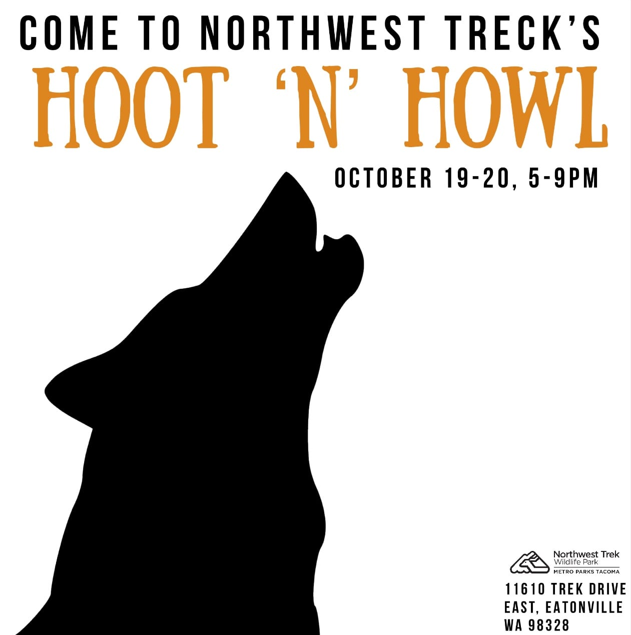
First draft
My first ad (above) was ok. I didn’t quite convey the message of what a hoot and howl was, I was lacking some sort of slogan, and I was missing something in the main design, such as an image.
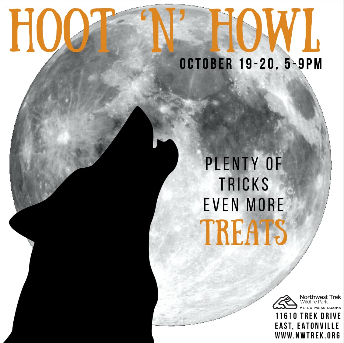
Second draft
My second draft was a bit better. I still wasn’t really explaining the hoot and howl, I still didn’t have a slogan, but I added a moon. The moon wasn’t very well photoshopped but it added the extra image that the ad needed.
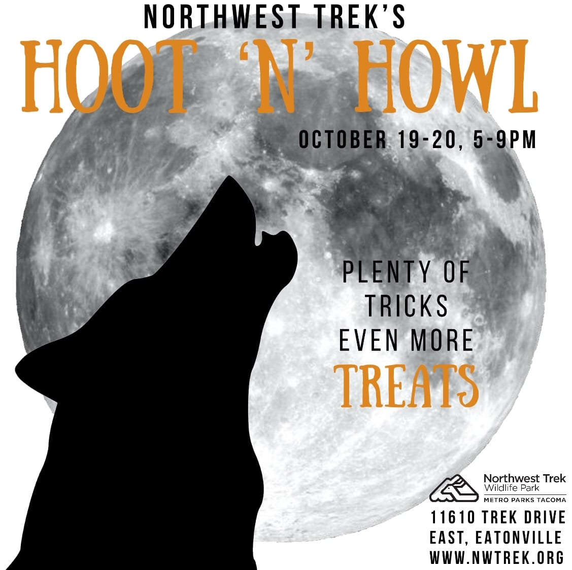
Third draft
My third draft was nearly there. I explain the hoot and howl by adding a slogan, I made the moon look bigger and it looked much better. The only thing it was still wrong was the photoshop on the moon.
Fourth draft
In my opinion my fourth draft looked good. I have a good slogan, I explain the hoot and Howl, and the photoshop on the moon looks good.
I learned a lot from making the Oregon business ad. I learned more about improvising (the interview), using white space in an ad to make an image pop, and I learned a lot about photoshopping in general. I am very proud of my final product and I’m glad I learned the things I did.
Bye for now✌️

Leave a Reply