As usual I’m going to start with the driving question: “How might I use technology to create and communicate?”
At the start of this project, we were split into two different groups. One group was focused on photography and the other on drawing. The overall purpose was to progress in our skills using the ipad for artistic expression. Each group was given an artist for inspiration, which for photography was Fred Herzog and for drawing the inspiration was the famous Emily Carr.
Caitlin and Hannah I were in the drawing group to start, otherwise known as Carr.
The app we used was called Sketches Pro and we enjoyed exploring the different pen options, here is a photo of the different types of pens, and my personal favourite is probably the fine liner and then the pencil for outlining.
We started learning about how apply pressure with the apple pencil, for example when you push harder on the pencil when drawing it makes the line thicker but when you angle it to the side and dont press hard it becomes thin and has less opacity. Then we tried out the built in patterns and quickly moved onto creating our own. I highly enjoyed making zen tangles. Soon after we learned about shapes and drawing circles with all the different tools that make the shapes have perfect, clean edges. After learning those basics we applied those in into creating a drawing a of our name that reflected us in it! Here is mine:
 This is my final name I made!

Next we proceeded onto shading and identifying shapes. For this mini project we used a cup for our object, this is the one my table group shared: 
Continuing with the mug we identified the shapes: 
Maybe you expected this but then we drew the mug and mine didn’t turn out how I expected it to. I struggled with the shading and it looked too chunky. So I redrew it as a different mug but I still think I could do better if I ever draw one again.


Since we learned the basic elements of drawing we created a robot using our knowledge of shapes and shading. When I was drawing my robot I realized I had to shade my head and try and make it realistic, but I chose a hard shape to do and I was halfway through already…and I was not about to start over! Now I know what shapes are the easiest to draw. Here is my robot:

The most useful skill I learned about was probably sketch noting (our wonderful friend Karen helped us), the point of sketch noting is to get down your thoughts with a more visual approach. We had to listen to a video of a person talking about why doodling is effective, the video is called Doodlers, Unite!. Here is what I came up with its my very first sketch note:

I find sketch noting an effective way to make verbal information visual, but personally I like writing plain notes since it’s easier for me to navigate through and create checklists.
One of the very last skills we learned was about perspective, we learned about the vanishing points and how to make rooms look more 3D and realistic. When doing this we also navigated through layers, and I find layers super helpful since it makes it easier to overlay drawings and being able to erase a certain components of a drawing with out erasing the things you want to keep. The first thing we did when learning about perspective was drawing a room, we did this by locating the vanishing point then making all the lines of the drawing lead up to it. Then we used a photo on the internet and located where the horizon line was and what the point was where everything leads up to (aka finding the leading lines). The hardest thing for me was having to draw something around the school, I did not do very good on this since I picked a difficult spot to draw. Also I finished drawing then realized I did it at a completely different angle and had to restart (it was delightful). Finally we drew a still image of a landscape we are familiar with, for example a deep cove landscape would be good. What I used was a photo I took in Sunshine Coast, here is the photo: 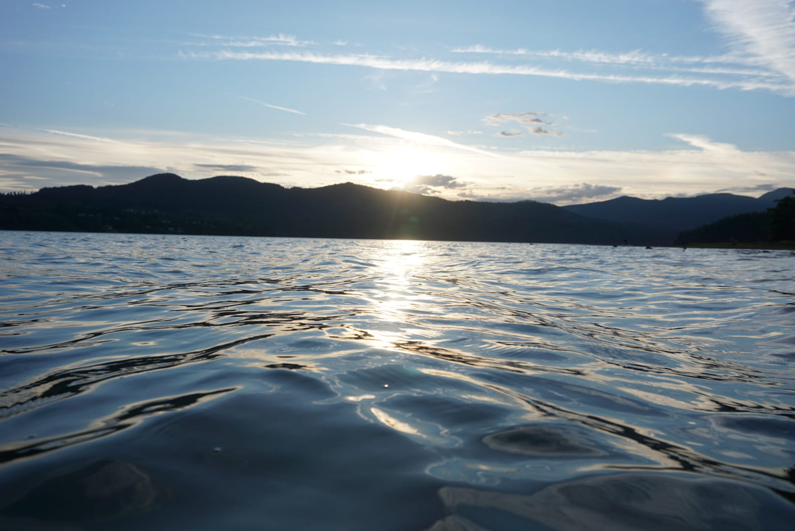
Drawing this was hard, my drawing ended up being kind of abstract because of all the different hues of blue and having to blendy blendy everything. Here is a slideshow of of my completed art work:


The last thing we did was create a logo with the help of Mrs. Maxwells friend, Chloe Devine. Chloe is a graphic designer living in New York, she has been in the industry for 3 years.
To start off we had a zoom call with Chloe, some students went up to ask these questions:
Sofia – What did you want to do when you were
younger? Did art naturally come to you?
Cam – How did you fall in love with designing?
Mackenzie – When and why did you decide to move to
NYC?
Gwenyth – What apps do you use to create your art or
graphic designs?
Susan – How do you incorporate shapes into your
designs?
Naomi – What is the hardest part of graphic design?
Hannah – What is the favourite part of your job?
Keaton – What is your favourite tool to use?
After having insight on what to do we created a design brief about what our business is and what the logo would look like. Here is my design brief: 
After getting my brief approved I moved on to drawing my logo (quick insight on what my business is, its a bakery filled with deserts but all in tiny proportions), we had to choices in apps that we could create our logo on, Sketches or Keynote. I ended up choosing sketches, my idea for my logo was to have a birds nest with macaron’s in it. My first attempt was quite messy but I still went on with my idea of a birds nest. After drawing 2 more birds nest I was on my 4th one, and after adding the macarons I realized it wasn’t going to work. So I scrapped that idea and decided just to do a stack of macarons instead. Here is a slideshow of all my drafts:
 This is my birds nest logo

In conclusion I have learned a lot more about digital art in the past week than I have in basically 11 years. I’ve learned about shading, perspective, shapes, disappearing points, and more. The drawing I am most proud of is my final name draft, the reason I like it is because I made every letter part of me. I didn’t just draw the things I like in the letter, I made the letter look like an object. A challenging thing was getting rid of my bird’s nest idea. I really loved my idea of having a bird’s nest in my logo since I love nature and baking so I thought it would be a good way to connect them. I had to tell myself that no matter how hard I tried I would never be satisfied on how it would look, so eventually after persuading myself it was to hard for me I got rid of it. One thing I would work on next time is my shading, I would try and make it a more gradual effect instead of making it one block of colour. Even though I learned how to gradually get darker or lighter I usually ended up with a colour block, but I know I can create a good gradient. I think drawing is a great way to express your self and show you view on the world, I prefer digital art over physical art since it’s more forgiving with my expert level of skill.