Today is officially the first blog post that I will write for math! Even though I say “math” I think that this is actually a pretty interesting topic that we looked at. We were learning about something called correlations. This is basically when 2 graphed data, look like the could be related to each other but they don’t directly cause each other. Now that might be a little confusing right now, but don’t worry by the end of this post it should make since.
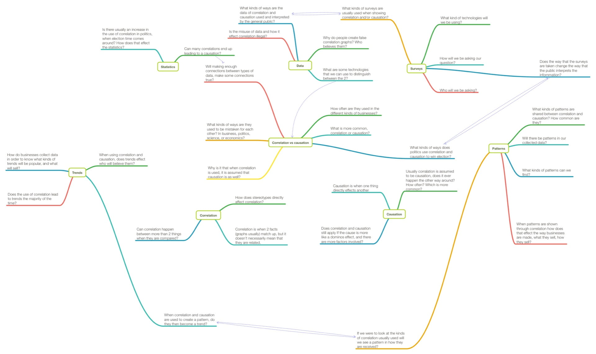
So what was the actual assignment that is supposedly “interesting”? Well, we were given the task to survey a group of people in order to collect data that would be used to show 2 correlations. One with causation and one without. We did this task in partners. My amazing partner for this project was Ally (link). Before I can get too into this first we had to do the not so interesting stuff. The first thing that we did was create a mind map of what we know and what we needed to know. Now if you have read any of my previous posts you may know that making mind maps are more of my style. At the end of this project I added to this mind map to show a before and after of what I learned.
Like I said, I like mind maps. The next thing that we had to do was figure out what our topic would be. What were we going to make our project about? Then we had an idea. Ally decide that she was going to conduct a survey about the quality of your breakfast and how hungry you are in school. I was really into something called the Mandela effect, so I decided to conduct a survey on your knowledge of the Mandela effect, and the effects it has on you. The Mandela effect is basically when a large number of people believe the wrong fact. For example, do you know the Queen song “We Are The Champions?” What was the ending lyric? Was it of the worllllddd! Or just we are the Champions? Turns out it’s just we are the Champions! What? Now if you knew that congrats but did you know that Darth Vader doesn’t actually say the iconic line, “Luke, I am your father?” He says “No I am your father.” Not too big of a difference but it’s still something. You can see why I was so interested in this topic. At any rate, we decided that we would each conduct our own surveys and interpret our own data, then at the very end we came together to create one final graph. Basically we took parts of each our data and put them together to show a correlation of 2 seemingly unrelated things. Our results were surprising. So what is the result you ask? Well, turn out…. you have to read to the end to find out. I’m sorry.
Alright let’s break thing down. I first had to decide who I would be surveying. At first I had wanted to survey all the teachers at the school but I found out quickly that they are incredibly hard to track down. So I decided not to pursue that idea. Instead I decided that I would conduct a population survey of my class. Based on this knowledge I created my survey making sure that I am not being biased. I chose to first ask about who knew about the Mandela effect, the proceeded to present examples of the effect to see what the reaction would be. I won’t lie, I can’t deny that my survey is completely free from all biased. However, keeping that in mind I went ahead and conducted my survey. To my surprise the majority of my class knows what the Mandela effect is. Even beyond that, I was more surprised when, despite the common knowledge of what the Mandela effect was, almost everyone was effected by the examples that I presented. Despite my results not being what I expected them to be, I continued on to interpreting and organizing my data. To do this I used an app called Numbers. I created 3 graphs from the information that I collected. The first showed how many people knew what the Mandela effect was. The second, about how people were effected by them. I used these 2 graphs as reference to create the 3rd graph which compared the 2.
Finally, the time had come. Ally and I got back together and looked at each other’s results. Then after much discussion, we decided which pieces of data we would take from each of ours. In order to conduct her survey properly, Ally had gotten people to take a standardized test. We made the choice to take the results of the quiz and combine it with peoples knowledge of what the Mandela effect was. Turns out that the belief in the Mandela effect is related to your performance in school. Now, when I say it like this, it doesn’t sound believable does it? However data shows…
That these things are related. This is a great example of what correlation is. From hearing about it, it doesn’t sound true does it? However by comparing data people are able to make these claims. That doesn’t mean that correlation always happens when comparing data. Sometimes there is in fact a connection. For example, the research that Ally did, shows that the better quality your breakfast is, the less hungry you are in school. Logically thinking this makes since because of protein and nutrition intake.
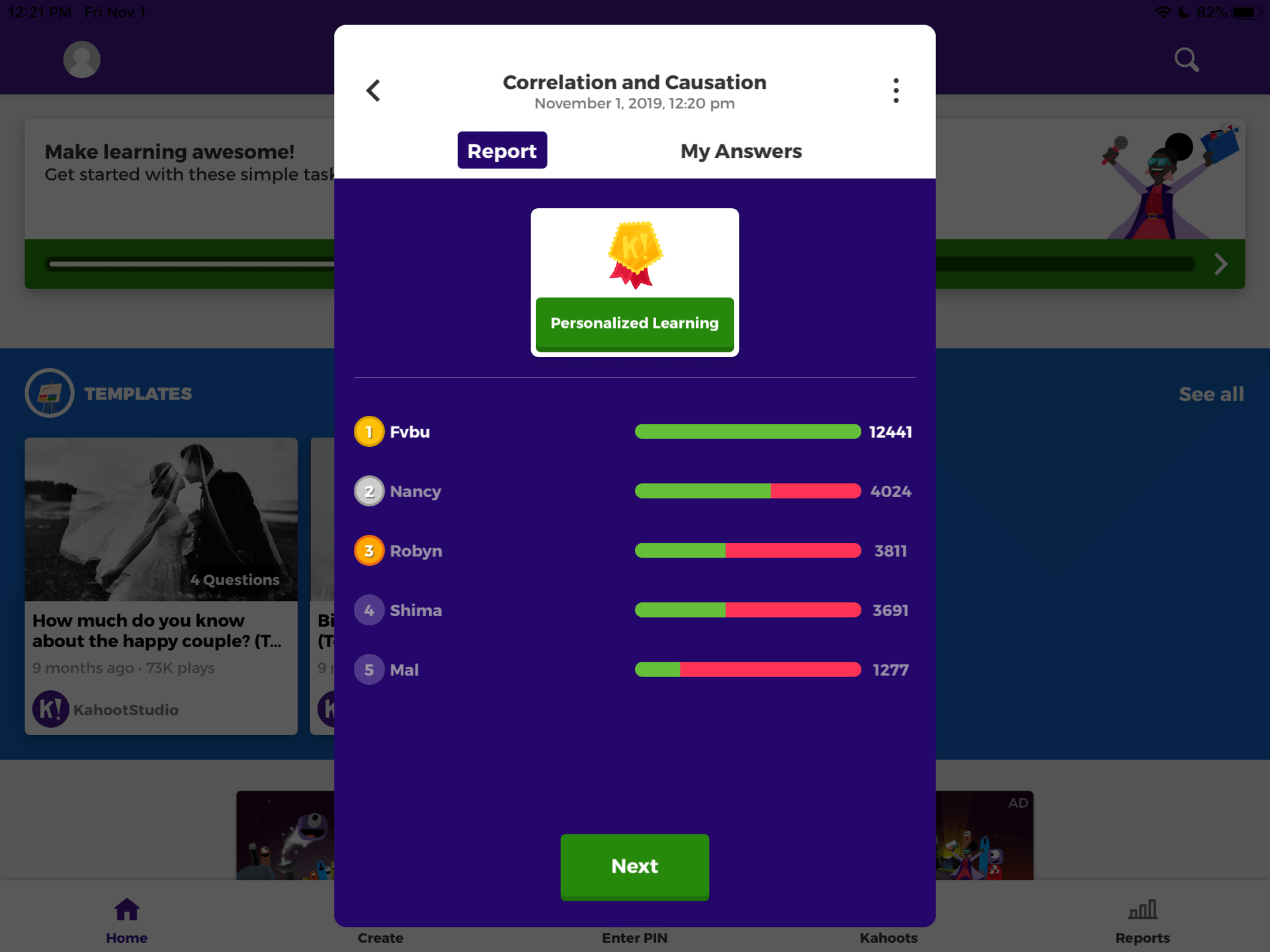
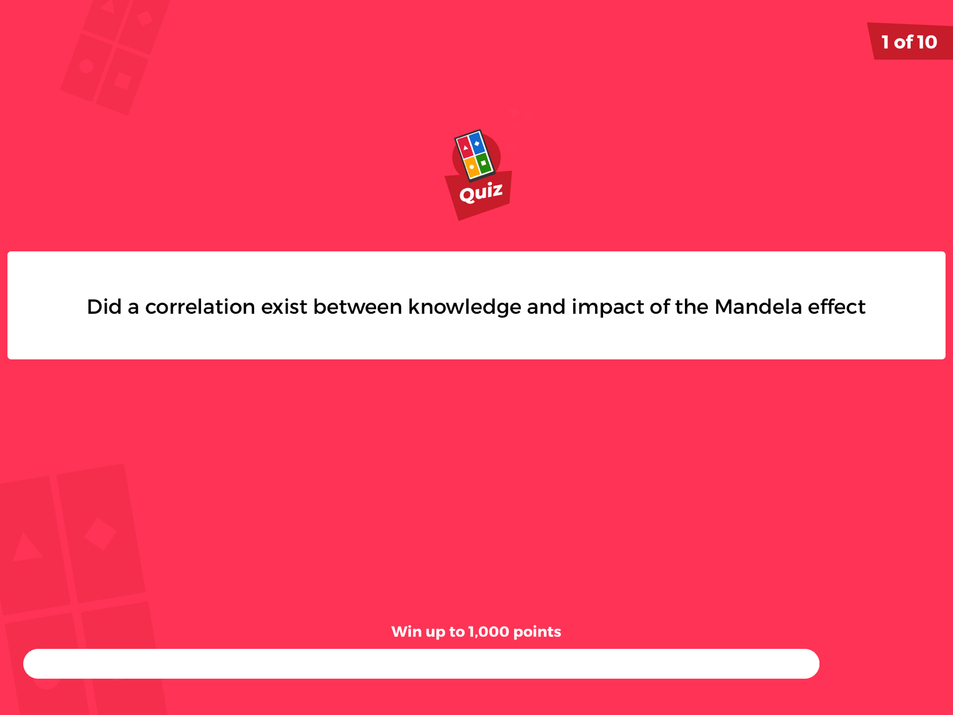
Finally we presented this using a keynote and a kahoot. After all this I learned what correlations are, how they works and how they can be applied to real life. Companies can use this for advertising. Candidates can use this in elections. This data can be used in so many ways to make people believe something. I realize now how convincing these correlations can be and they have made me begin to take a second look at what I am being told. All in all I believe that this was a cool thing to look into and I hope that you learned something too.


