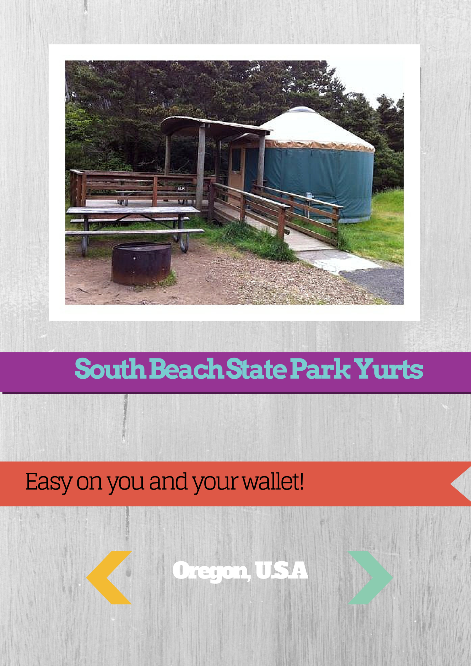
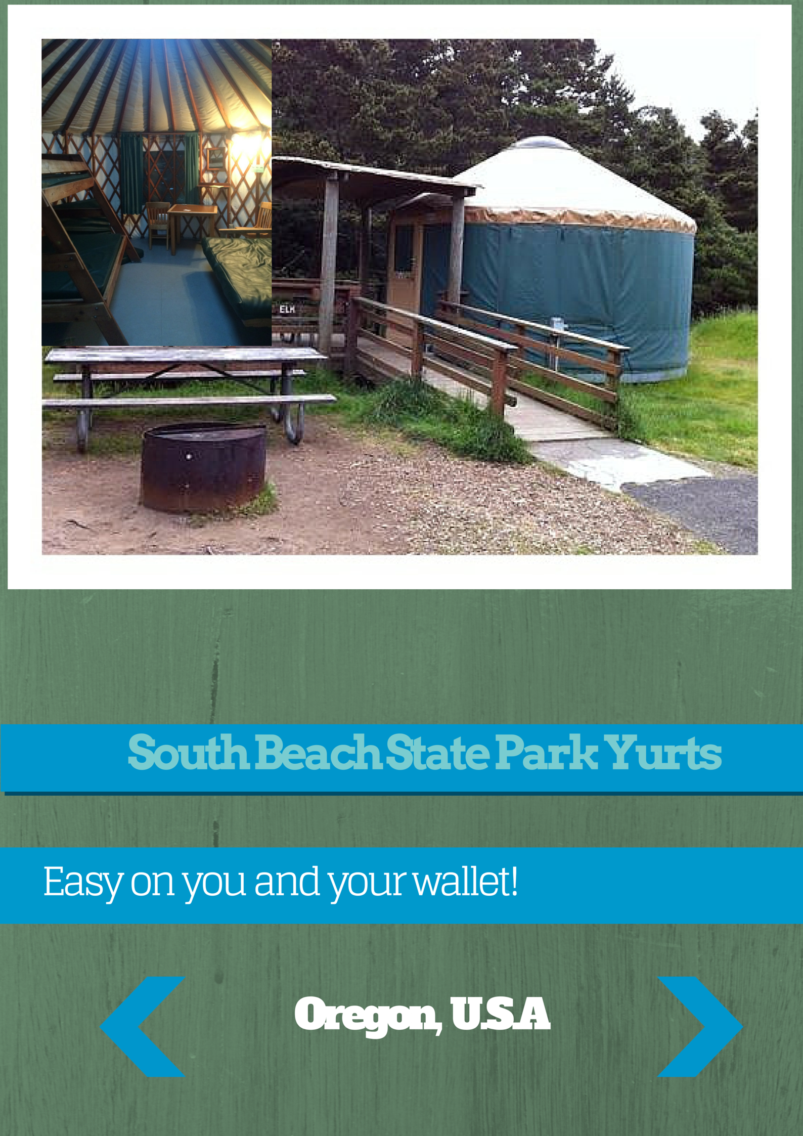
I designed three ad posters based on photos taken on our Oregon field study. One was a persuasive tourism poster for a natural landscape and my topic was the Newport Bayfront. Another was a business ad and I did mine on the Yurts we stayed at. For this one we were lucky to interview the volunters that worked there so it was easier to do the ad. The third was an environmental advocacy poster and the topic was don’t overfish. I had trouble getting a picture of an endangered fish so I had to use a different photo of the ocean.
I worked with Canva and Afterlight apps to make them better. I used editing techniques like adding colour text and using a filter. I added white borders and put text on colour banners to help get it noticed. I tried to add some humorous phrases to make it more memorable. We got feedback from our class and I used that to try and improve the ads. I made them clearer and brighter. Next time I would do more research earlier so I had a better plan for the photos I needed.
 First
First
 Final
Final
 First
First
 Final
Final
 First
First
 Final
Final
