Data is an Interesting Thing™
“Three times the charm? Nope.”
Correlation and Causation—
Our most recent project has been on correlation and causation.
For those who don’t know the terms;
Correlation-

Causation-

Now, I worked with one Alivia Ward on this project. We worked together to come up with questions for both a correlation question and causation question.
The Beginners Journal to Data—
When we started this project, we learnt about correlation and causation on the first day. To have it explained to us, we were shown graphs and videos.
Some of the examples we were shown were as follows:


And one of the examples we gave ourselves were as follows:

The class we started this unit was right after a humanities class where we were asked to practice animating things. So I decided to animate a man being choked by a bedsheet whilst skiing. I got fed up midway through. I never finished it.
After that we were put in groups.
Alivia and I were put together and soon after, we began our project.
The Project Gets Goin’—
This project was a lot of research and data.
For our first part of our project, our “correlation” question, we looked at…

We split up the work, I looked at data of tuition for Penn U, while Alivia looked at data about homelessness in Calgary.
We then collected the data together, and created a graph showing the results

For our “causation” question we looked at;

We looked at multiple things for this question, but in the end we went with that question because it was the only one that actually worked.
To gather our information for this question we made a survey and sent it out to our class, and put it on our social medias, to get replies from people not just in 9th grade and Vancouver. We got some answers from people all over Canada in different grades.
To do that, we sent our survey not just to our friends we see every day, but also people we met at Encounters With Canada when we were in Ottawa for our PLP trip.

Trial and Error—
As with any project, there were errors in our work.
The biggest example of that was our correlation question. I can’t even remember all of them.
We kept coming up with correlation questions, and then finding that the data didn’t correlate, so we would re-do it, the new one wouldn’t work as well and it cycled.
Eventually we found one that we originally didn’t think would work, but did in the end.

Presentation is everything—
Something one gets used to after being in PLP for two years, is presenting.
And of course, that is because we do it after almost every project. To get feedback, or to show it to a final audience, we almost always present our projects. It’s why we all work so hard on our projects in PLP. Someone IS going to see this work, and when they do, you don’t want it to totally suck.
Anyways, we presented.
We had two choices for our presentation,
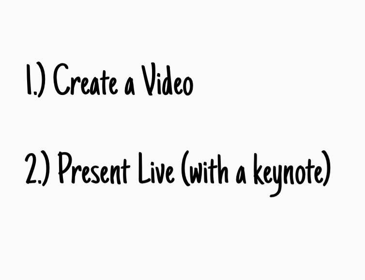
We decided to go with option two. Presenting live.
So that’s what we did. And I don’t think we failed.
It probably could have been a bit better on my side. I only say that because I was so much more calm during my presentation with Kai in my last (math) project *LINK* and this time I kind of panicked.
I’ve been trying really hard to be calmer during presentations recently, so this was unfortunate for me.
Other then that, I think we did pretty well.
In Conclusion…—
Data is an interesting thing. And when looking at it, the numbers can be a lot.
But there is always use for a good ol’ fashioned data collection.
Thanks for reading about the data Alivia and I collected for this project!