
Introduction
For the winter term Blue Sky exhibition the Grade 9 class was assigned the theme of Harry Potter. This ties in to the fact that we are going to Florida in February and will be spending a day in Harry Potter World at Universal Studios.
After my work experience day at Amazon, I knew that I wanted my Blue Sky project to be in the area of design. I needed my project to require Illustrator and Photoshop so I could justify to my parents that they really, really needed to get the Adobe Student Creative Cloud license. They agreed to buy a year’s subscription on the promise that I would use these programs a lot. It’s fair to say that I have kept my promise as I used them for my project and was busy through the winter break creating sports logos and designing a card game with my friends.
Blue Sky Project Question
My original concept was to redesign the North Vancouver school district team logos to use a Harry Potter theme – for example changing Seycove Seyhawks to the Seycove Hippogriffs. This idea was rejected for being too simple and lacking in inquiry. I like the sports themes, so I then started thinking about Quidditch and specifically the World Cup. After a bit of research on Harry Potter Wikia I found that it had been running since 1473 and was unchanged since the original tournament. This led to the idea for my question:
The Quidditch World Cup has been around since 1473, how could it be modernized to appeal to the smart-phone generation of wizards?
Planning Stage
Since I got accepted into PLP one of my goals has been to build an iOS app for a Blue Sky project. I have learnt some programming, but still nowhere near enough to develop my own app yet. I have seen my parents create mock-ups when they are working on new projects which are drawings that show what the app will look like when it is developed. I came up with the idea that instead of trying to build a fully programmed app, I could use a mock-up tool to create a “mock-app”.
I looked at a couple of different mockup tools. The first option was Balsamiq Mockups. This was easy to use and allowed the drawings to be linked to make it interactive, however the feel was very “cartoon-like” and so I felt it would be obvious that it wasn’t a real app. I then looked at Adobe Comp but this is just intended for making extremely simple outlines much like the ones I did on paper. I also considered creating them in Illustrator, but that would have been a huge amount of work as all the elements would have to be created from scratch and then I would have to figure out how to contact the screens to make it interactive. I finally discovered the perfect tool via Google Search which was Mockingbot. This is an online mockup development tool that makes it easy to produce highly realistic mockups and included a ton of awesome features such as scrolling. This tool would allow my “mock-app” to be fully interactive.
Once I settled on my app tool, I needed to think about what elements to include in the app. I looked a similar apps that have been developed for the Olympics and FIFA World Cups to get ideas about how these sports are promoted. I also read Quidditch Through the Ages as I wanted to get ideas about how to improve the game of Quidditch by updating some of the rules.
I started coming up with lots of ideas, so I used a mind map app to organize my thoughts for the content of the app.

Creating the App
The first step was to create a mock-up of my mock-app! From my mind map I had a good idea of the areas I wanted to include. With a pencil and paper (yes real ones) I drew really rough outlines of each of the main pages in the app. Here are a couple of those drawings – as you can see they are very rough and don’t contain much information. However, they were very useful in organizing my time to get all the pages done.


Once I had these done, I started working with the Mockingbot tool. It turned out to be really easy to work with and I was able to set up and start creating my pages quite quickly. There was a bit of a learning curve, but I gradually figured out how to use the different UI elements and came up with a consistent look and feel for the app pages. I used Illustrator to create my own tournament logo and selected the colours that I wanted as my primary and secondary colour throughout the app. I also learned how to use some of the more complicated features of Mockingbot that allowed the app to be fully interactive and include scrolling content.
Here are some screenshots from the early stages of development:


Adding App Content
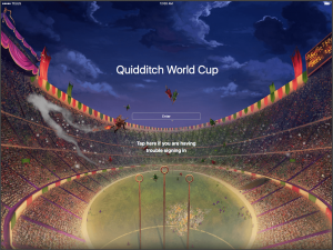
The app consisted of the launch screen, 7 tabs and the Muggle Quidditch page. The launch screen shows an Enter button and then a option if you are having trouble logging in. This was to provide anti-Muggle security. To enter the real Quidditch app you have to swipe right on the Enter button. If you tap the help option you end up on the Muggle Quidditch page which provides some basic information about muggle Quidditch.
The Home tab was the landing area after entering and included welcome information, a link to the live game player, 3 news stories and the Twitter feed. I created a real Twitter account and tweeted throughout the time I was working on the project. It wasn’t possible to directly embed the Twitter feed into Mockingbot, so I took screenshots and make a dynamic panel on the screen so that you can scroll from one screenshot to another. This made the Twitter feed seem real. For the live game player, I obviously couldn’t show real Quidditch video, so I set this up to display a screen indicating when the next game would be live.
The History tab consisted of two scrolling panels: the first contained general information about the history of Quidditch, in the other panel I showed the previous winners of the tournament.
In the Rule Changes tab I described a set of alterations that I came up with to try and improve the game flow. These were my own ideas based on research from Quidditch Through the Ages and having watched the Harry Potter movies. I tried to come up with changes that would help the game be more entertaining and have less cheating.
The Teams page was the biggest amount of work. I decided to have 32 teams in the World Cup as this is done in FIFA which is the most popular World Cup. For each Team I made a roster and listed the scores of all their games. I had to create 32 sub-pages to cover all teams, and ensure that each of these subpages was correctly linked to all others, to ensure that this page was fully dynamic.
The Results tab contains two sub tabs: the first is the group standings and the second shows the elimination bracket.
For the Venues tab I used created a Google My Maps showing the stadium locations throughout the US. I then embedded the map into Mockingbot which allowed me to have a fully interactive map within the mock-app.
The Store tab was one of the most fun to create. I used Photoshop to create a video game cover for a wizard gaming system. I also created an advertising poster for the Quidditch World Cup and decided to sell that in my store. I then added my QWC logo to other items including a hoodie, phone cases and even teddy bears to sell. My friend Alex was creating a new Quidditch broom for his Blue Sky project, so I decided to offer his broom through my store, and then discounted the Firebolt as it would no longer be as popular. When you click on an item in the store you get a confirmation that your item will be delivered via Owl Post.
Building the App Data
When I came up with the design I decided that I wanted to have 32 teams in the tournament and display a detailed team page for each country. This added a lot of work, as I needed to come up with a team roster and scores for every single game in the group stage and all the elimination rounds. I used name generator tools for the rosters and then I created an excel spreadsheet to keep track of game scores. As I am a sucker for detail, I also had another spreadsheet that included the qualification groups and the wild card games.
The spreadsheet of scores helped ensure that all the data in my app was consistent across all teams:

The Finished App
My completed app runs on any real device. To view the app, either scan the QR code below on a phone or tablet or you can view the app in a desktop browser by clicking on the image below and then pressing the play button to launch the app.
Note: Wizards swipe right to access secret information that should not be available to muggles. Wizard apps are also always viewed in landscape.
|
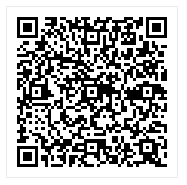
Scan QR code to install app on device |
The Exhibition
At the exhibition we were put into groups to present in. Each group was given an area in the library and had to turn it into something Harry Potter themed. My group got the back of the library and chose to make it look like the Forbidden Forest. We made a drink that we called “Spiders Blood” it was really just some sprite with food colouring in it. I was supposed to dress up as a centaur as Robbie convinced me that he could help me with the costume. Unfortunately he didn’t have time to make this happen, and so the night before the exhibition I tried to create a centaur costume from an Amazon box. It did “kind of” work however the costume did not survive the exhibition setup time and my centaur sadly ended up with 2 broken legs!

In my area for presenting I had my Mom’s iPad Pro with my app on it, my video game box, my poster printed on to some high quality paper, my mind map and the QWC hoodie. Unfortunately being at the back of the library proved to be a little bit too much like the actual Forbidden Forest as not very many people got all the way back there. They would get to the group just in front of us and then turn around which was a bit frustrating. Also my presentation didn’t go as well as I had hoped because people are hesitant to touch/use the iPad. I had hoped that people would interact with my app, or download it on their own device from the QR code. Instead most people just looked at my display so all they saw was one page of my mock-app rather than using it. This is definitely a lesson for future Blue Sky exhibitions, that I need to find a better way to encourage visitors to interact with the iPad if it is a core part of my project.

Leave a Reply